
Designing an AI Agent
An agentic camping-trip booking POC, designed and built with AI collaborators.Overview
Most product design problems come with inherited vocabulary: established patterns, familiar controls, years of precedent. Designing an AI agent didn’t. Plenty of thinking exists about what agents could do. Far less exists about what they should feel like to use.
That gap raised questions no component library could answer. If the agent suggests something the user doesn’t want, is Reject different from Show me another? If a user removes a constraint mid-conversation, should an earlier UI control disappear with it? What happens when the agent finds the right campsite, and then availability changes before the user can act on it?
I built CampOps Consumer, a proof of concept for an agentic camping-trip booking experience, to work through those questions with the same structured discipline I’d use on any product, and to find out whether that discipline survives contact with a domain I don’t have inherited expertise in and a workflow where the tools themselves keep changing.
If you’re hiring for a design role that touches AI product work right now, this is the actual skill gap most teams have: not whether someone can prompt a model, but whether they can direct one, catch it when its output looks finished but isn’t, and hold the line on product truth the model shouldn’t be allowed to own. That’s what this case study documents.
PROCESS
Research & product definition: ChatGPT-assisted research, PRD, agentic UX principles
Design: OOUX → workflow → design system → 33 screens in Figma/FigJam
Build & validation: Claude Code, Next.js implementation, live scenario testing and regression
Stack
Figma + FigJam, ChatGPT, Claude, Claude Code, Next.js, TypeScript, Tailwind, shadCN/ui, Zod, GitHub, Vercel
Timeline
About 4 days of focused work from initial research to a tested working implementation.
My Role
Solo. Research, product definition, interaction model, OOUX, UX/UI design, AI direction, technical prototyping, testing, and evaluation.
Methodology
OOUX (Sophia Prater methodology), agentic UX research, scenario-based evaluation, AI-assisted design and development
Project Type
Self-initiated proof of concept
Designed to explore agentic interaction patterns and test an AI-assisted product design workflow from research through working software.
Framing the Agent
The product wasn’t really about search
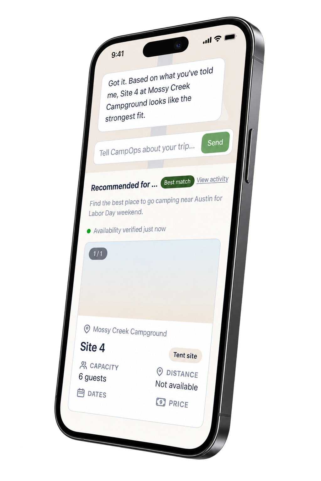
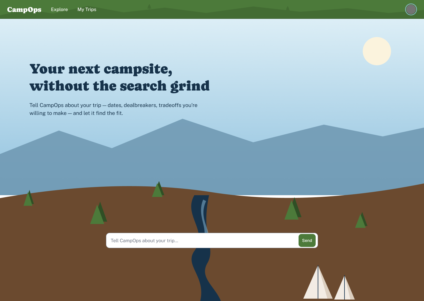
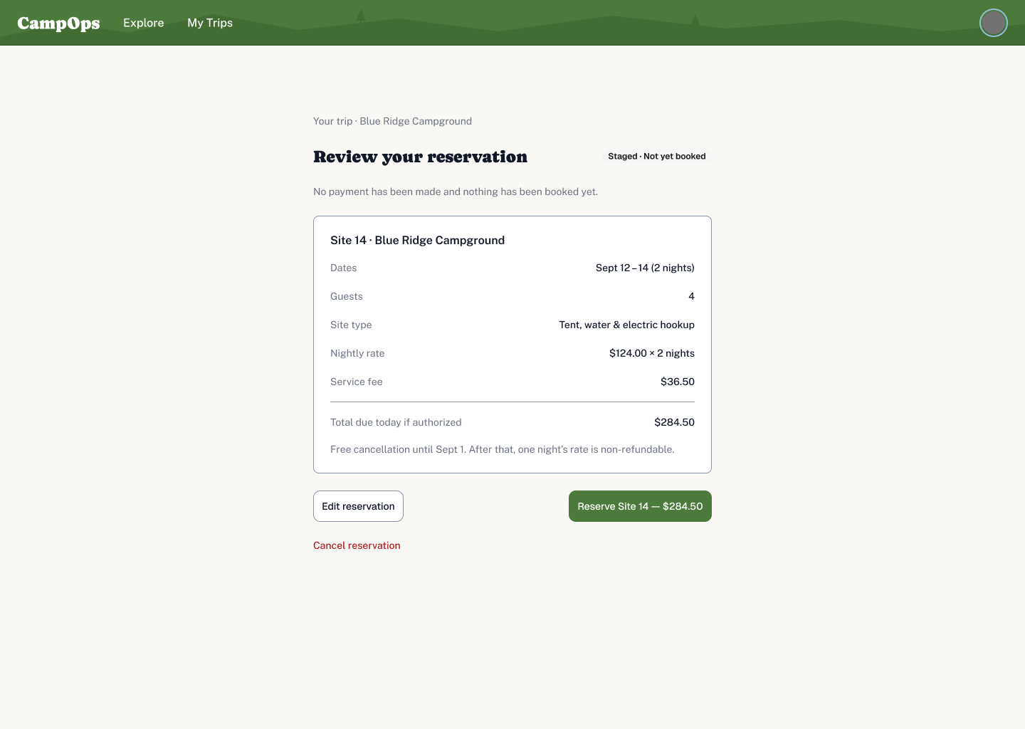
CampOps Consumer is a companion to the CampOps admin product. A camper describes a trip in natural language. The agent interprets what they mean, searches available inventory, recommends a campsite, adapts as requirements change, and prepares a reservation, but can’t complete anything financial or irreversible without explicit permission.
That boundary is what turned this from a search problem into a delegation problem. The user needs to understand what the agent knows, what it’s doing right now, what changed, and where control still belongs to them. Get that wrong and the product feels either untrustworthy or exhausting, permission prompts for everything.
I needed structure before I needed screens
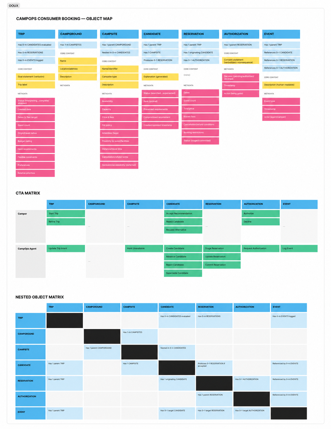
I started with research and a PRD, using ChatGPT as a research and product-definition partner. From there, OOUX identified the objects the experience actually runs on: Trip, Campground, Campsite, Candidate, Reservation, Authorization, Event.
The exercise changed the model in ways that mattered. Constraint looked like its own object at first, but failed the Structure/Instances/Purpose test and collapsed into an attribute on Trip. Amenity behaved like a real object on the CampOps admin side, where an operator manages amenity inventory, but failed that same test on the consumer side, where a camper only ever filters by it. Same domain noun, different structural role, depending entirely on whose job it’s answering.
The failure paths shaped the happy path
Before any screens, I mapped the full workflow in FigJam, unsupported requests, no-match searches, requirements changing mid-task, availability disappearing, not as cleanup work after the happy path, but as first-class parts of the map.

That surfaced something a happy-path-first approach would have missed: unsupported requests and no-result searches started as two separate dead ends, but they’re the same interaction problem wearing different clothes. The fix wasn’t a new screen. It was recognizing they needed the same recovery behavior and building it once.
Defining the Interaction Model
One recommendation, not another results grid
Traditional search asks the user to compare options and do the synthesis themselves. Tell an agent “somewhere near Austin next weekend with WiFi, and I’ll pay more for it,” and a real agent should be able to do more than translate that into filters.
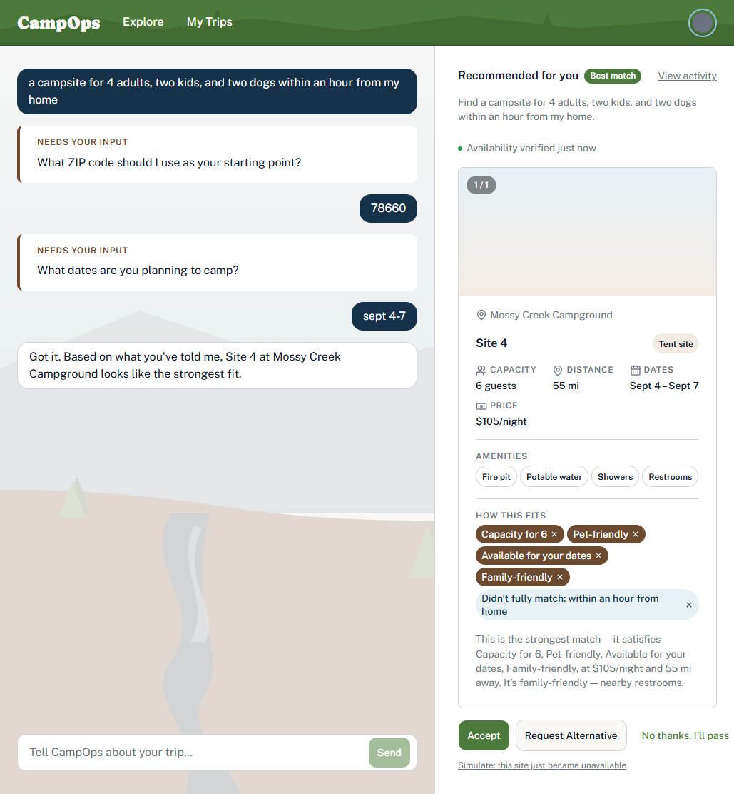
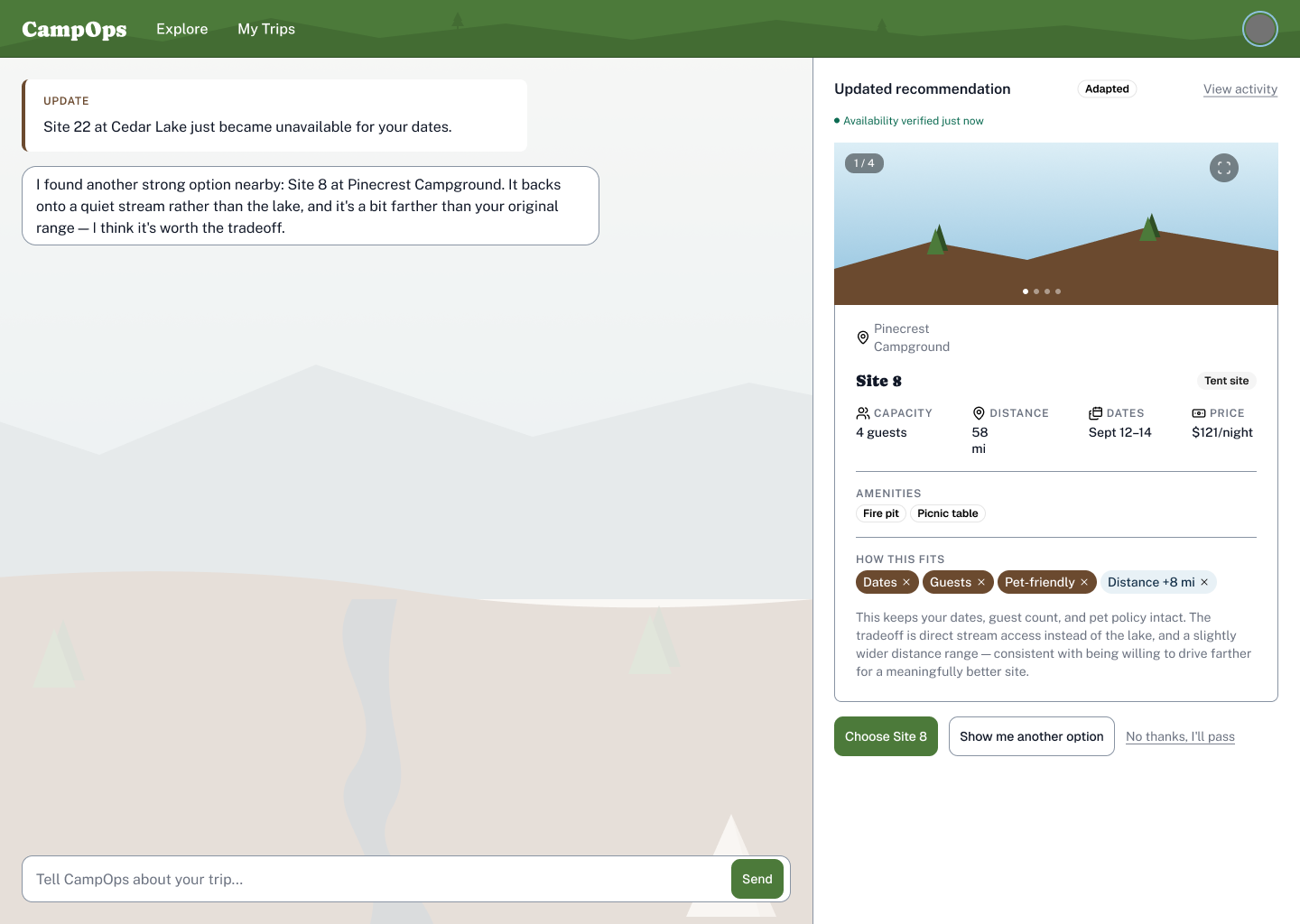
I chose single-recommendation-forward: the product says, in effect, given what you told me, here’s the campsite I recommend, and here’s why, rather than opening with a grid. Current agentic-interface research backed keeping attention on one recommendation and one clear next action over falling back into a conventional results experience, and I checked that against the research rather than trusting that instinct on its own.
That’s a hypothesis, not a proven preference. A ranked multi-option version tested against this one with real users is the obvious next experiment, and I say so plainly in the limits section below rather than overselling a decision I haven’t validated with actual campers.
“Reject” and “show me another” are not the same
That decision forced a second one. Asking for another option means the user still wants the agent to finish the job. Rejecting the recommendation without wanting a replacement means something else entirely: walking away.
A compliance review against the PRD and Design Brief caught that those two meanings had quietly drifted together into one button. I kept both actions, but gave Reject the low-emphasis treatment a closing action deserves instead of dressing it up as another “try again.” The interface got clearer because the underlying model got clearer first, not the other way around.
Not every problem needs another button
I also considered an Undo control next to removable preference chips. The obvious safety mechanism in a traditional interface. But the conversation itself already restores anything removed, so a dedicated Undo would have solved a problem the interface didn’t actually have.
Claude flagged the duplication. I checked it against the actual accessibility requirement before agreeing to remove it, since flagging something as redundant and confirming it’s genuinely covered by an existing exception are two different levels of rigor. The lesson generalizes past this one control: agentic UX doesn’t require surrounding every uncertain action with a visible fallback. Sometimes the conversational layer already is the fallback.
Designing With AI, Not Deferring to It
I used ChatGPT for research and product definition, Claude for design reasoning and Figma execution, Claude Code for implementation. The interesting part was never that AI made the work faster. It was learning how often an answer can look completely reasonable and still be weakly reasoned underneath.
The color system is the clearest example in the whole project
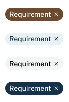
Claude produced a first pass at the requirement-chip palette that looked fine. Nothing was wrong with it on sight. There was also no real reason behind any of the choices, they’d been picked because they looked good together.
I pushed it back and made it defend every choice from scratch. What came back had actual meaning: drawing from the color system and rationale used for the design, earth for hard requirements, the ground you build on; sky for flexible ones, conditions that can shift; water for the tradeoffs that need judgment instead of a lookup. This is the actual shape of the work now. Not picking the colors myself, but knowing enough to recognize a plausible answer that isn’t a reasoned one, and having the standing to send it back until it becomes one.
AI assistance still needs a second set of eyes
The workflow produced real failures along the way, and none of them survived into the final work because I was checking output, not trusting intent:
- Claude deleted an entire component page and had to rebuild it from scratch.
- A repeatable Figma operation-order bug (setting a frame to hug its content, then resizing it, silently reverts the hug) clipped containers across the file. It recurred at least eight times before the fix, resize first, set hug-sizing after, was fully internalized.
- A hidden optional chip, set invisible by default in its master component, got stripped out of every downstream copy entirely on publish. Not hidden. Gone. Caught by checking the actual published output against what should have been there.
None of this is a case against using AI collaborators for real design and engineering work. It’s the actual job description now: direction, review, pattern recognition, and the discipline to keep asking why when the output looks plausible on the first pass.
Taking the Design Into Working Software
Figma wasn’t enough proof
The design covers 33 screens across three sections, Intent & Search, Recommendation & Adaptation, Staging & Authorization, every state traceable back to the workflow diagram, with a documented design system covering components, behaviors, and accessibility requirements down to exact contrast ratios.
Static screens can show the experience. They can’t prove the product logic holds together, and they specifically can’t test the one boundary the whole architecture depends on: what the language model is allowed to interpret versus what deterministic software has to control. So I built it.
A hard line between the model and product truth
The Next.js implementation uses GPT only to interpret language and return structured, validated intent. It never sees inventory, never calculates a price, never ranks a candidate, never touches reservation state. Every one of those claims is checkable in the code, not just asserted: outputs are re-validated even after the SDK’s own parsing step, every invalid reservation-state transition throws, the API key never reaches the client.
The model is good at understanding what someone means. It doesn’t get to become the source of truth for anything the product itself is supposed to know.
The build found problems the screens couldn’t
All eight PRD evaluation scenarios ran live against the working system: normal searches, changed requirements, unsupported requests, lost availability, and a stale-response race condition where a requirement chip removed mid-search got silently restored once that now-outdated request finally resolved. Figma has no async behavior to test. That bug only exists once the real thing is running.
Two more failures shared the same root cause. The model correctly extracted a guest count of 20, but nothing downstream actually checked it against site capacity, so a 20-person request was silently passing against 4-person sites. Weeks later, pet-friendliness failed the identical way: the evaluator matched only the literal word “pet,” so “dog-friendly” returned “couldn’t verify” even though the data could answer the question correctly. Same shape both times, a structured field the model captured correctly that nothing downstream enforced. The second occurrence is what turned it into a standing rule: a structural enforcement guard now exists specifically so the same class of gap can’t recur silently, and it didn’t, a family-composition feature added afterward reused the same guard without reintroducing the problem.
One product hypothesis survived the build
The strongest proof of the actual product idea: a request for a site with WiFi, worth paying more for, correctly re-ranked the recommendation to the one qualifying site over cheaper, closer alternatives. Done in one reasoning step, work a filter-based search would leave entirely to the person using it.
That doesn’t prove people prefer an agent making that call. It proves the architecture can represent the tradeoff, evaluate it, and explain the result, which is exactly the behavior this POC set out to test.
Evidence, Limits, and What Comes Next
What this POC proves
Every designed state has a working counterpart. The design system passes AA contrast, checked against both ends of its gradients, not just the easy one. The model/application boundary is implemented and independently verifiable, not just claimed. All eight evaluation scenarios pass, with regression coverage, clean type-checking and linting, and repeatable tests built directly from the failures found along the way.
What it doesn’t prove
No production analytics, no measured decision-time or task-completion data, no evidence people trust this more than conventional search. Distance uses ZIP-centroid approximation, not real routing. Mobile navigation is intentionally scoped down. Some Candidate Card behaviors, the photo carousel and lightbox, are specified affordances, not built interactions. Most importantly, single-recommendation-forward passed every scenario I wrote for it. That proves the reasoning works. It doesn’t prove people want that much of the decision handed to an agent.
What I’d test next
Human evaluation over more feature work. Single-recommendation against a ranked multi-option model, measured on task success, decision time, backtracking, and confidence. And whether people actually understand the delegation boundary itself, what the agent can decide alone, what needs permission, how well it recovers when the ground shifts mid-task. That evidence is worth more right now than another layer of polish.
What changed for me
I started this project to test whether the structured design discipline I use on traditional products would survive an unfamiliar agentic problem and a heavily AI-assisted workflow. It did, but not because the old process produced all the right answers.
It worked because structure made wrong answers easier to find. The object model exposed conceptual inconsistencies. The flow exposed missing states. Challenging AI-generated rationale exposed shallow decisions. Building the product exposed asynchronous and enforcement failures that Figma could not. Testing turned repeated failures into reusable rules.
That is the part of the project I would carry into a real product team. The goal is not to create a process that makes me right from the beginning. It is to create a system for becoming less wrong as the product becomes more real.
What changed for me
I started this to test whether the structured discipline I use on traditional products survives an unfamiliar problem and a heavily AI-assisted workflow. It did. Not because the process handed me the right answers, but because it made the wrong ones easier to find. The object model exposed conceptual inconsistencies. The flow exposed missing states. Challenging AI-generated rationale exposed shallow reasoning dressed up as a finished answer. Building the actual product exposed the async and enforcement failures no amount of Figma review would have caught. Testing turned repeated failures into rules that stuck.
That’s the part I’d carry into a real product team. Not a process that makes me right from the start. A system for getting less wrong, faster, as the product gets more real.
The tools did real work here, genuinely, not as a courtesy credit. But the product judgment, the system boundaries, and the responsibility for catching where the tools were wrong were mine.