
Overview
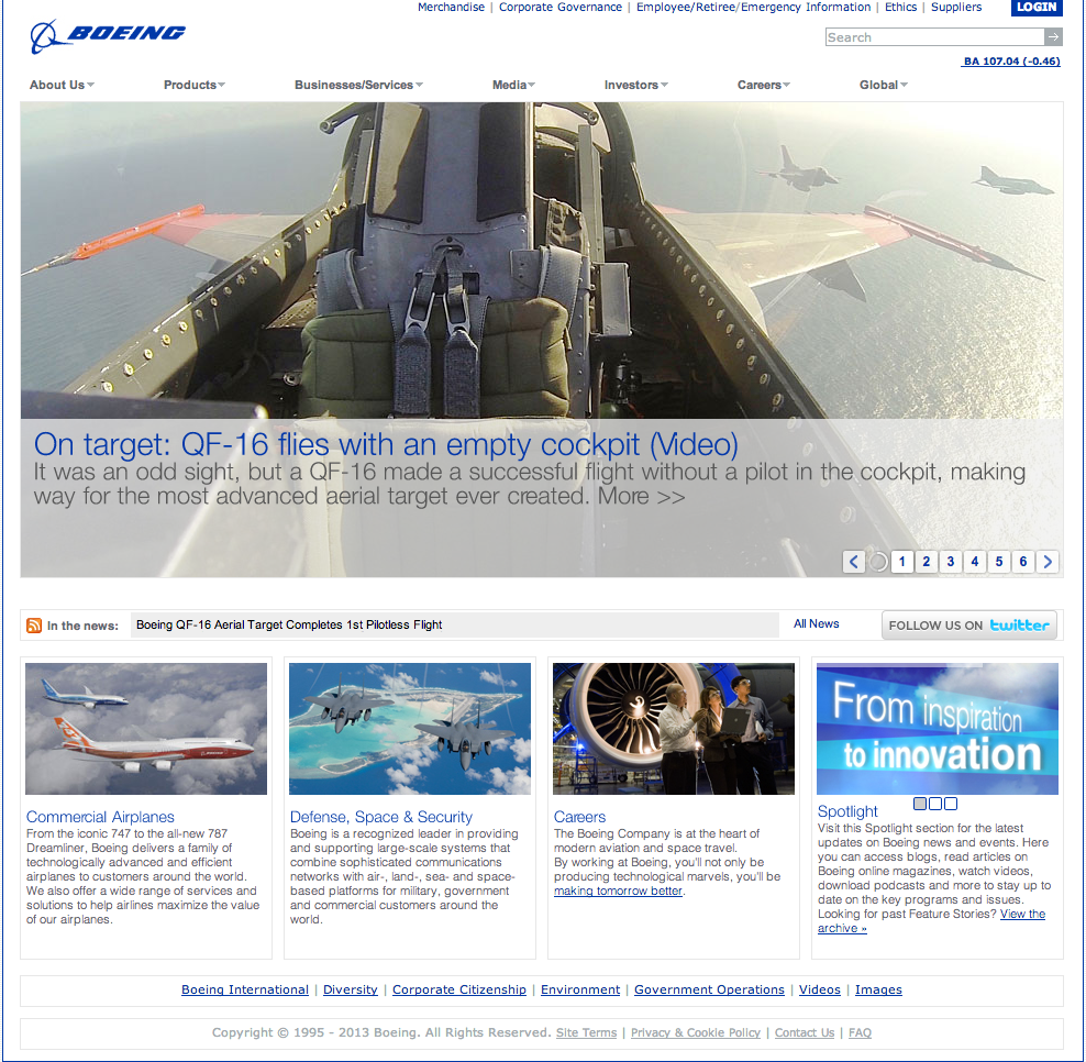
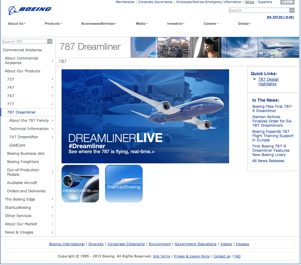
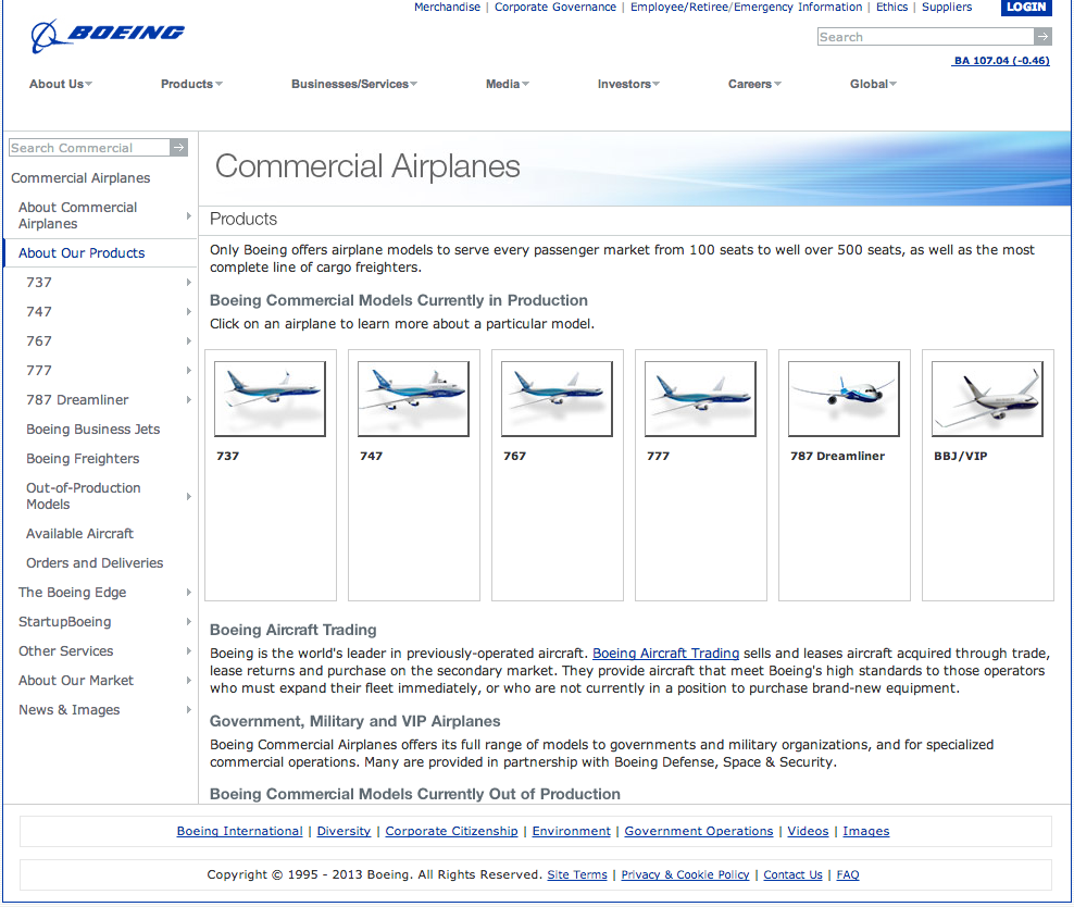
Boeing is one of the most recognized companies in the world, but primarily for commercial aviation. Their defense, space, and innovation work, which represents a significant portion of their business, wasn’t visible to most visitors. The site itself reflected that gap: outdated, difficult to navigate, and organized around internal structures rather than the way audiences actually thought about Boeing’s products.
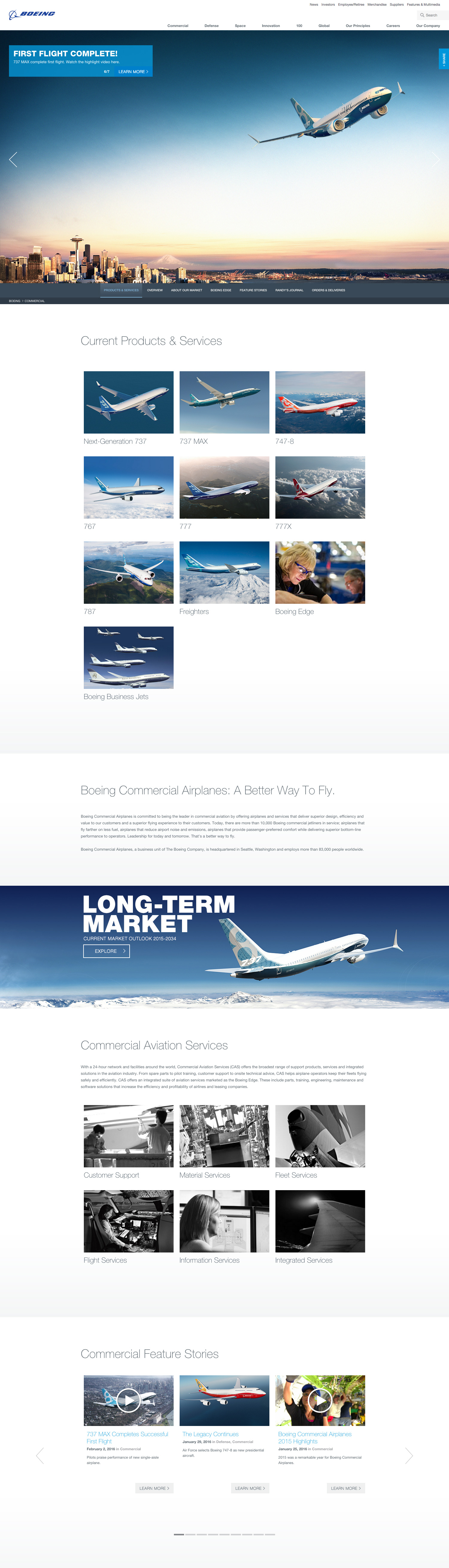
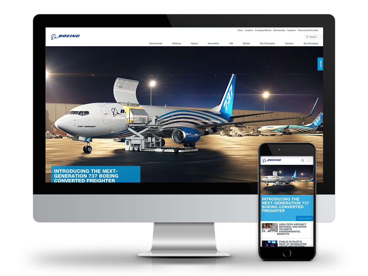
We were brought in to redesign Boeing.com from the ground up: new architecture, new experience, new visual design. I was the sole UX designer on the project, working at R&R Partners, responsible for everything from research and IA through wireframes, interaction design, and user testing. The final product was built as a fully responsive site, designed to adapt across desktop, tablet, and mobile breakpoints from a single codebase.
The site launched to three industry awards in 2015, including two W3 Golds and an Interactive Media Awards Best in Class.
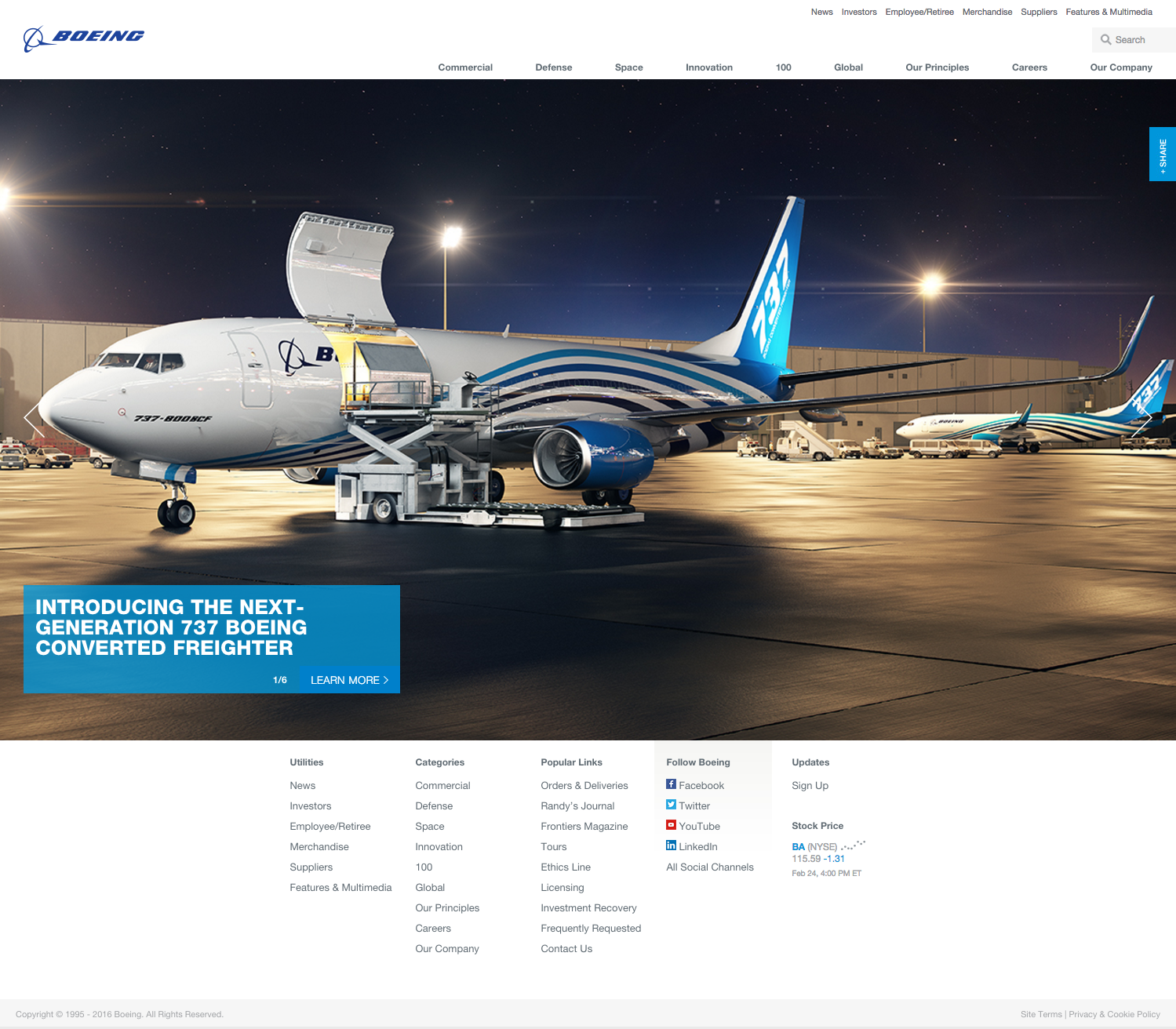
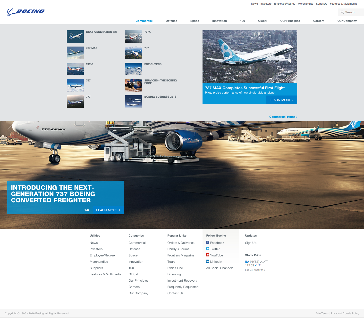
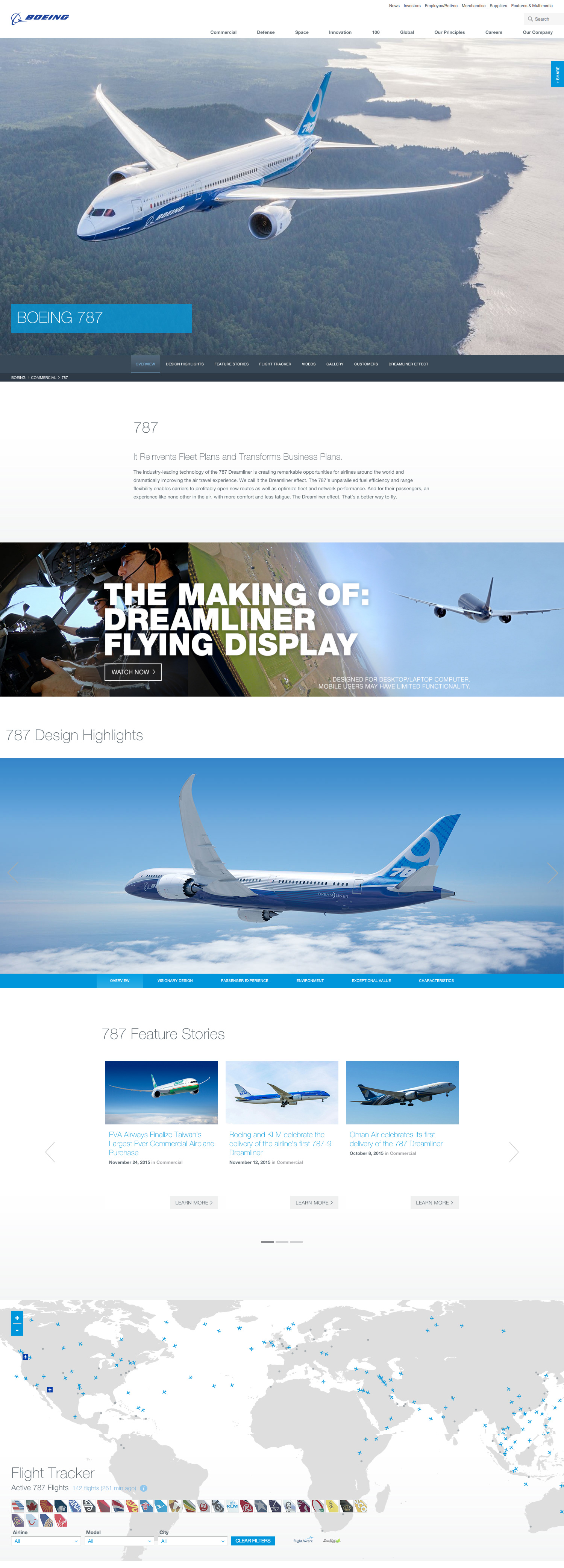
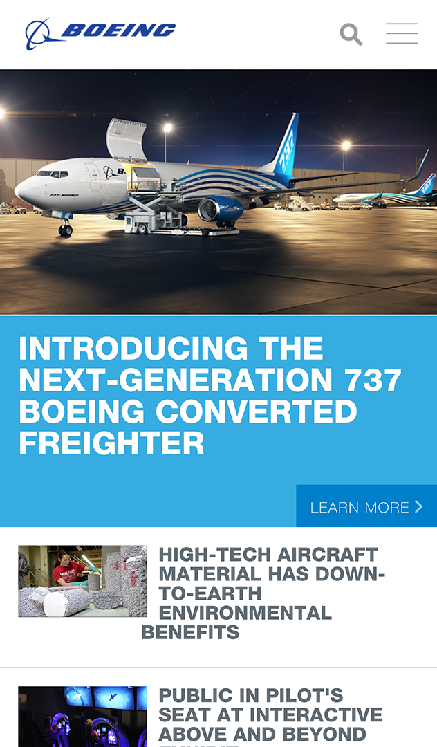
Created at R&R Partners for Boeing
The Scale of the Problem
The site had over 11,000 pages. That number wasn’t just a technical challenge, it was a symptom. Years of content accumulation with no governing architecture had produced a site that obscured more than it communicated. Our job wasn’t to redesign pages. It was to figure out what the site actually needed to be.
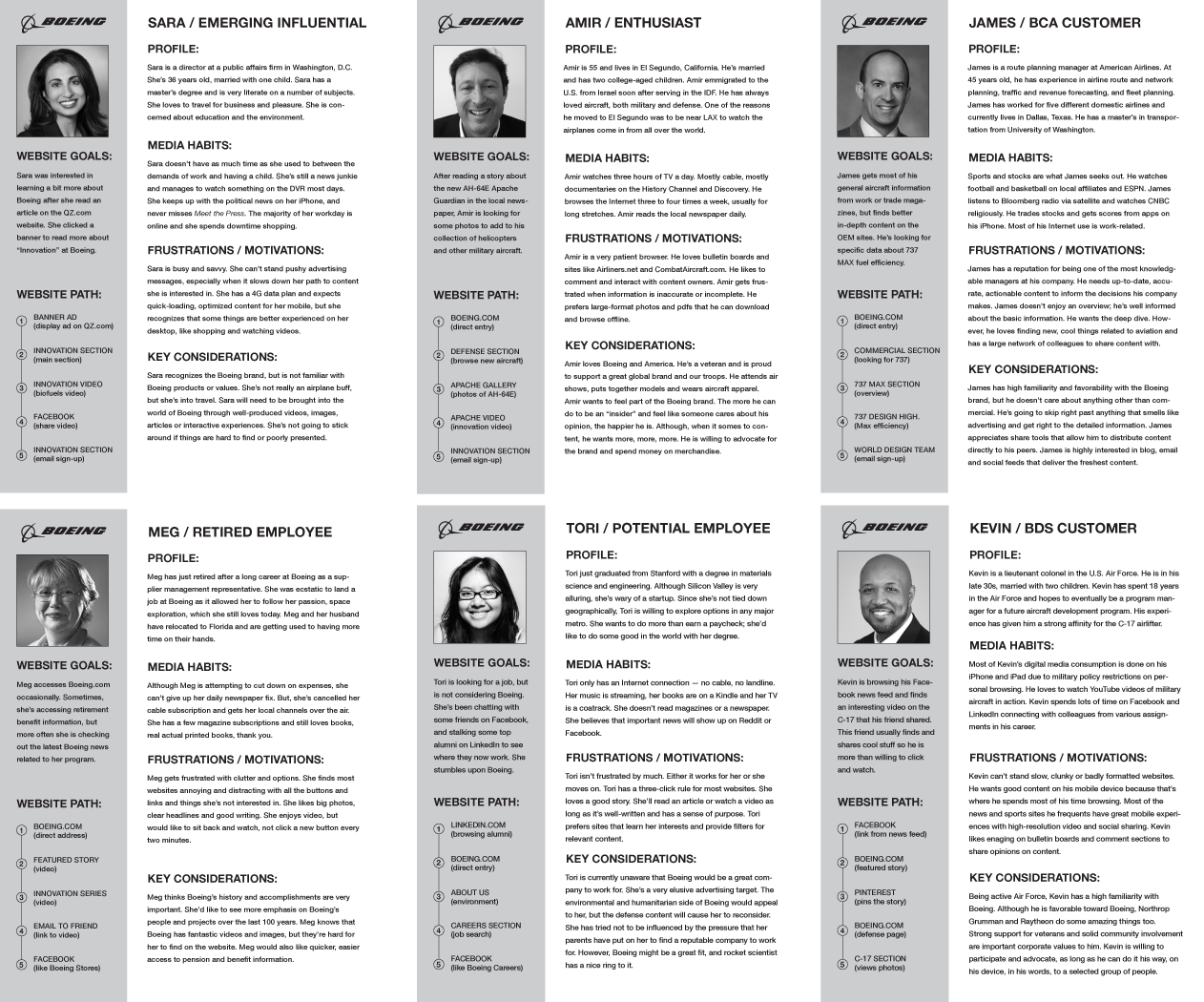
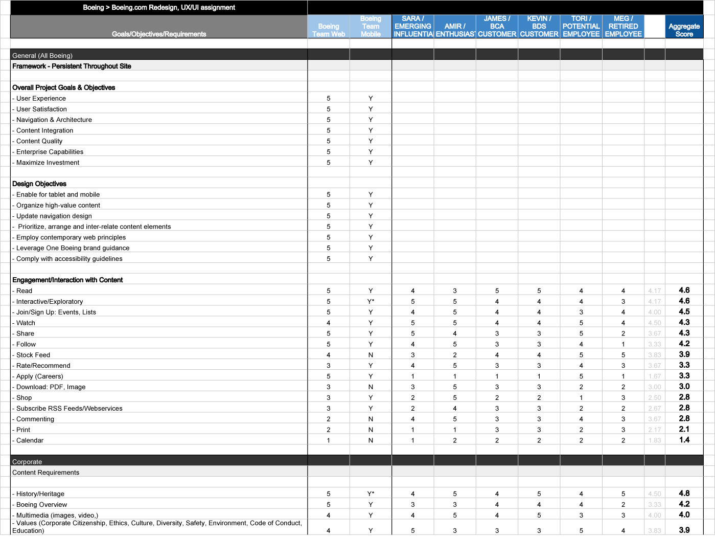
That started with understanding who was using it. We segmented Boeing’s audiences in detail, built personas to capture the distinct needs and mental models of each group, and ran a gap analysis to identify where the existing site was failing them. Paid media visitors, investors, job seekers, defense buyers, and aviation enthusiasts all had fundamentally different reasons to be on the site, and the existing structure treated all of them the same way.
Information Architecture (IA)
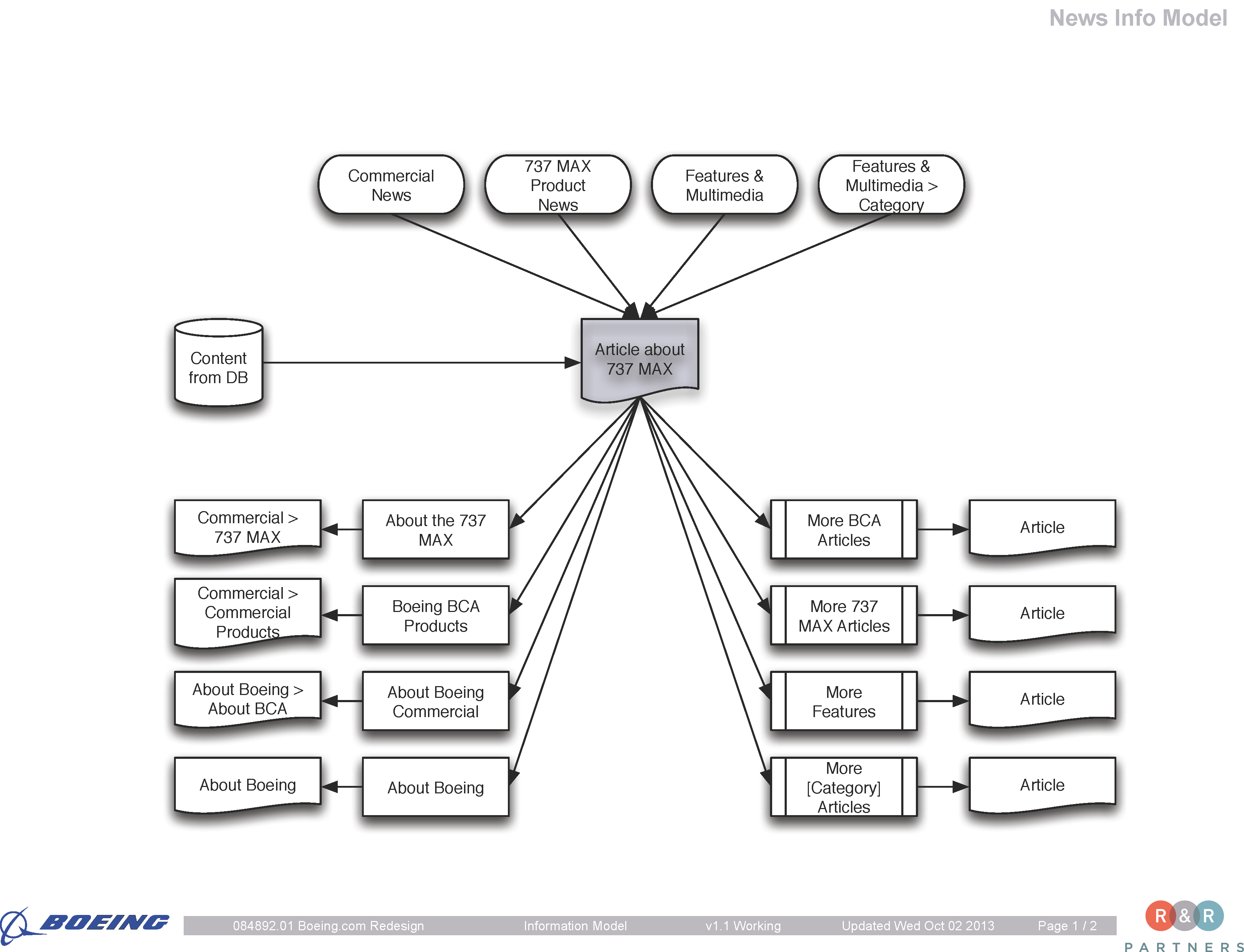
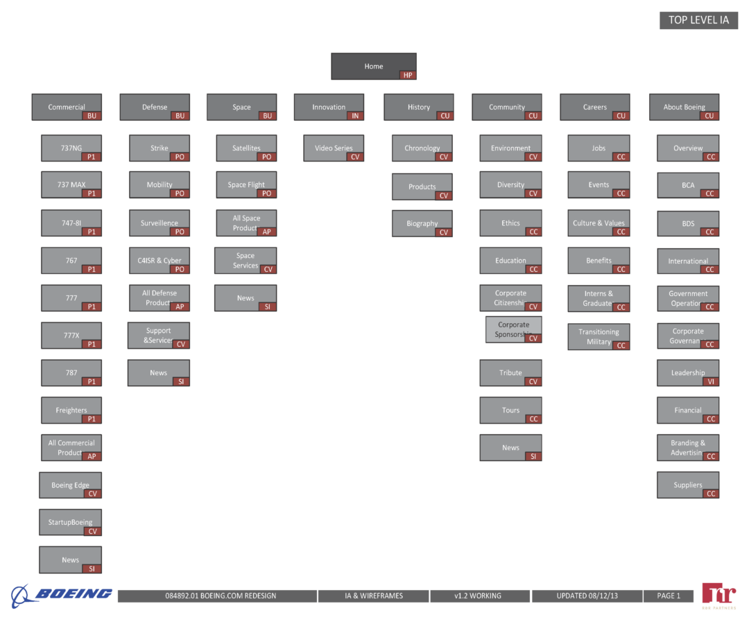
Reducing 11,000 pages to approximately 1,000 without losing anything the primary and secondary audiences needed was the central IA challenge. Every cut required a clear rationale, and every decision about what to keep had to be tied back to persona needs and content value.
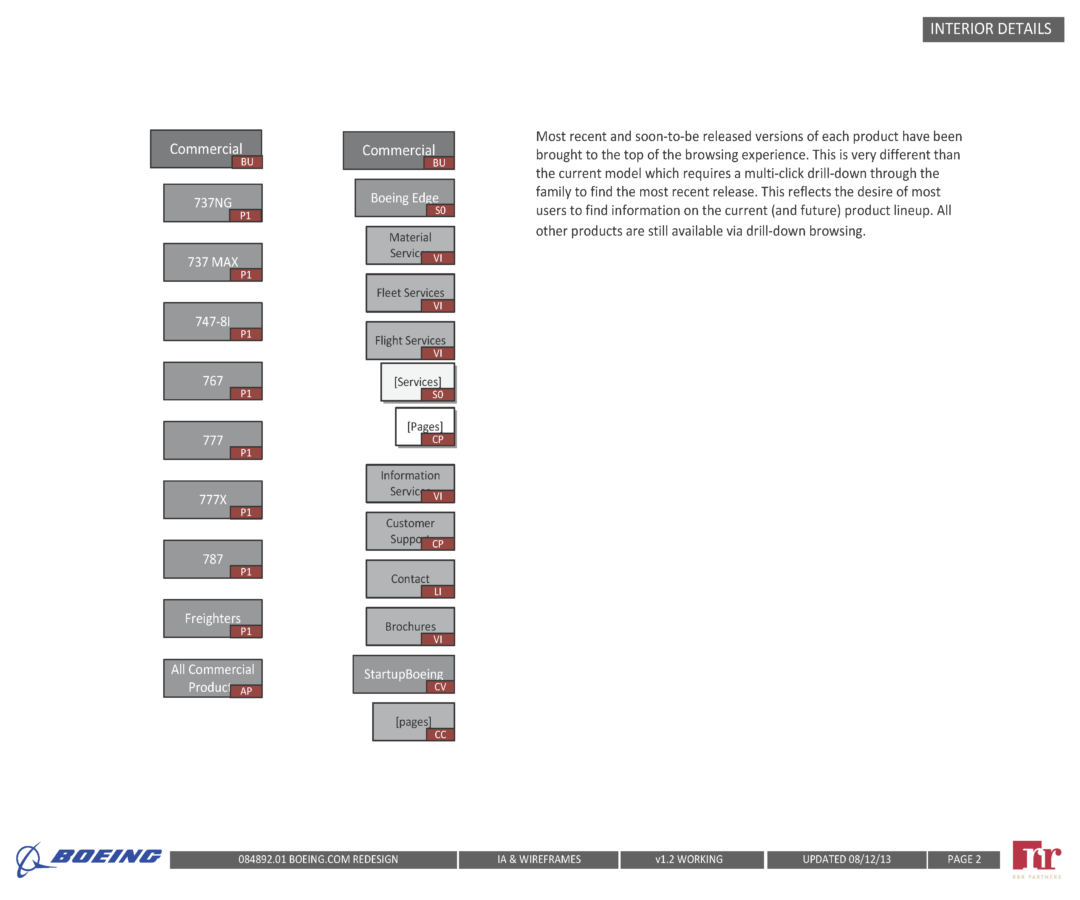
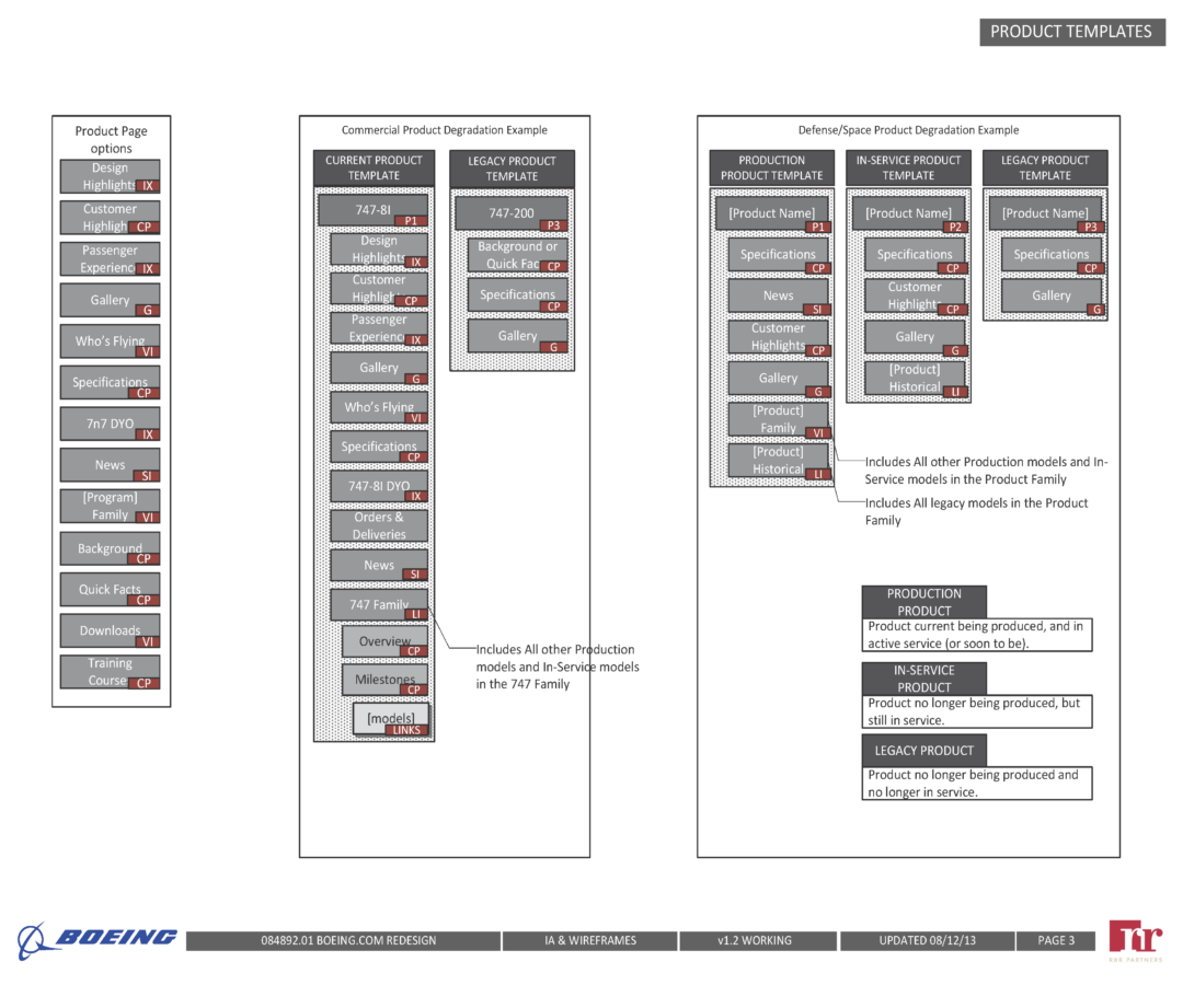
The more significant challenge was restructuring how Boeing’s products were organized. The existing taxonomy reflected Boeing’s internal divisions, not how the outside world thought about their work. We proposed a structure built around user mental models instead.
Boeing found the new structure compelling enough to restructure their internal business organization to align with it. When a client reorganizes around your IA recommendation, that’s the clearest possible signal that the thinking was right.
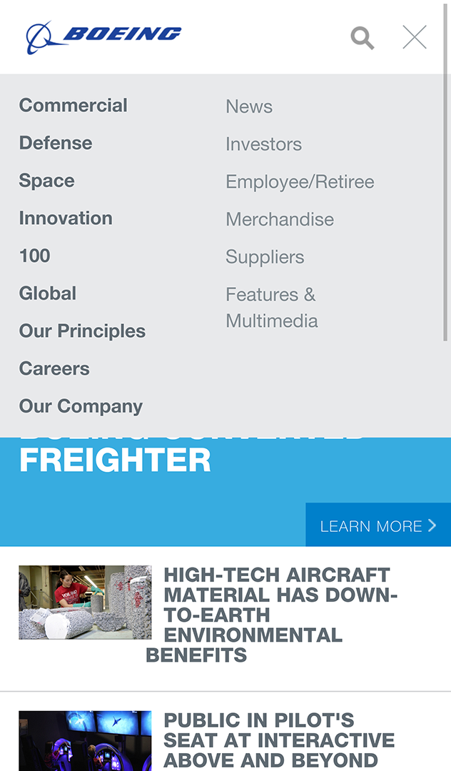
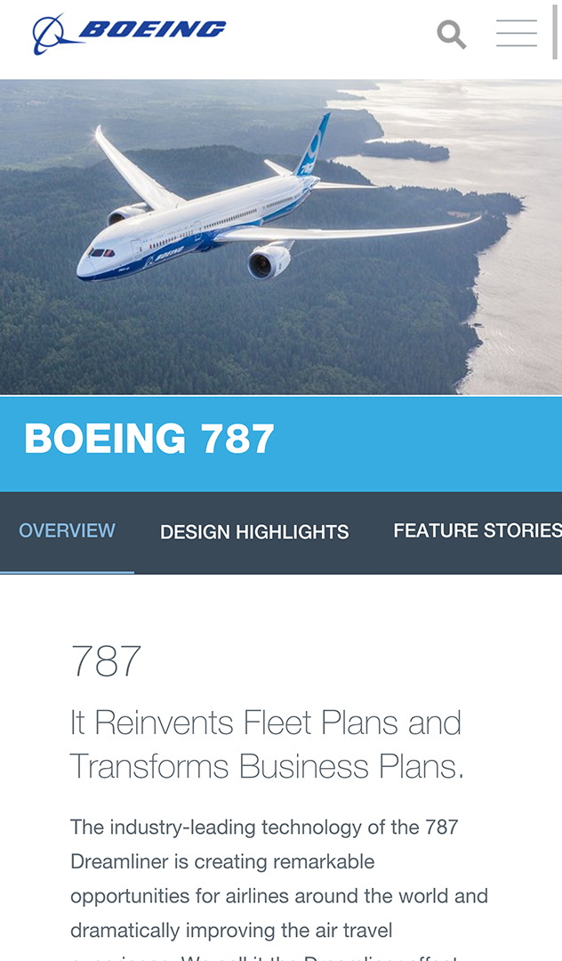
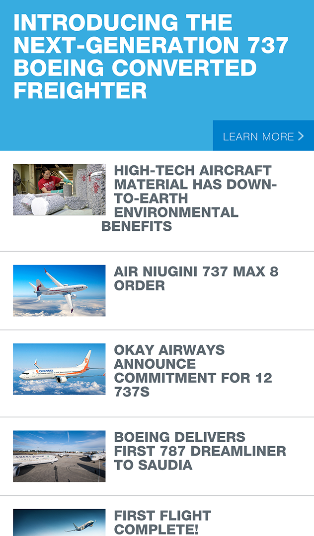
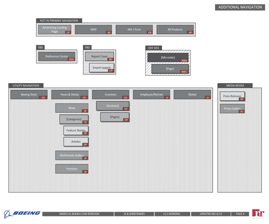
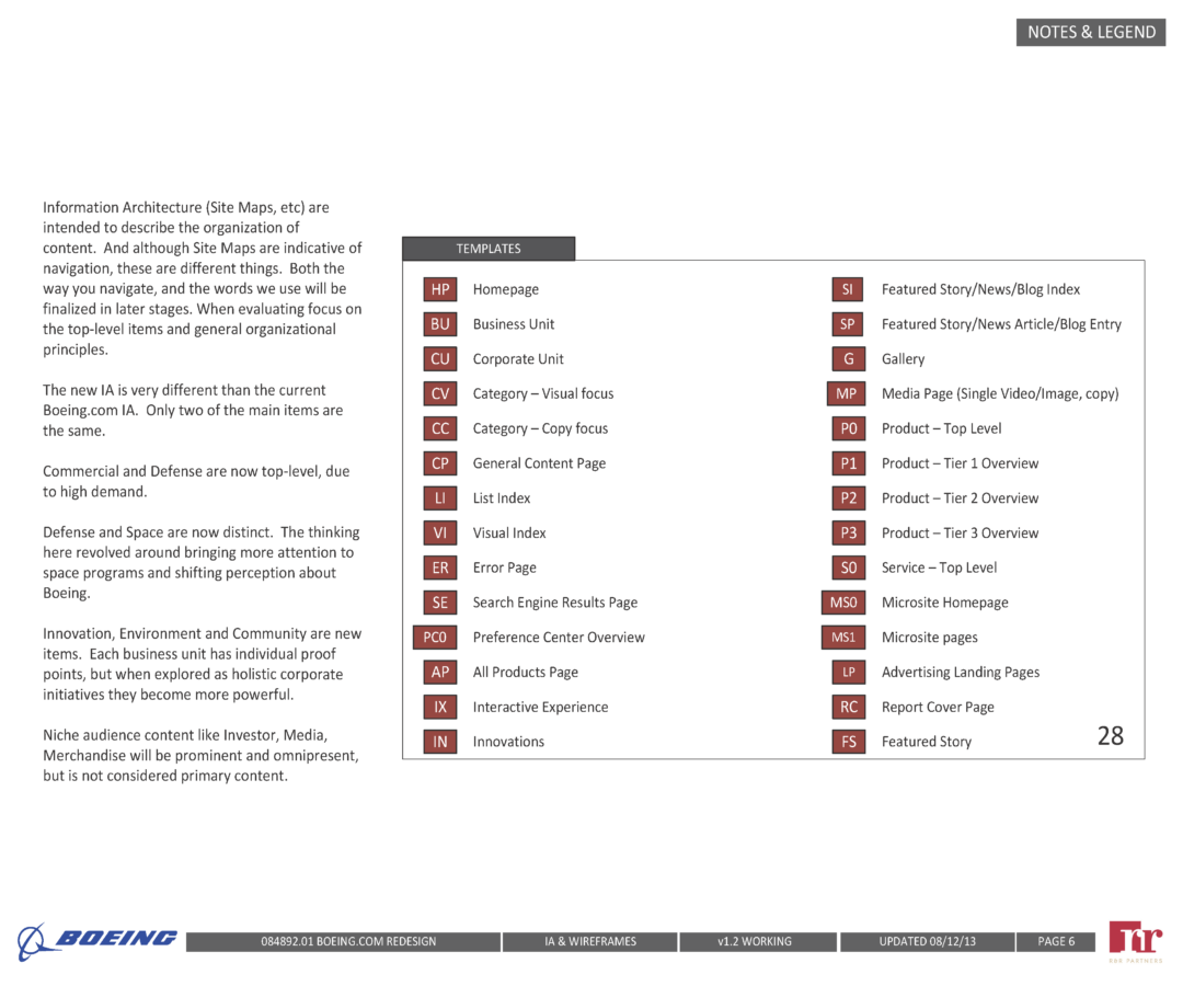
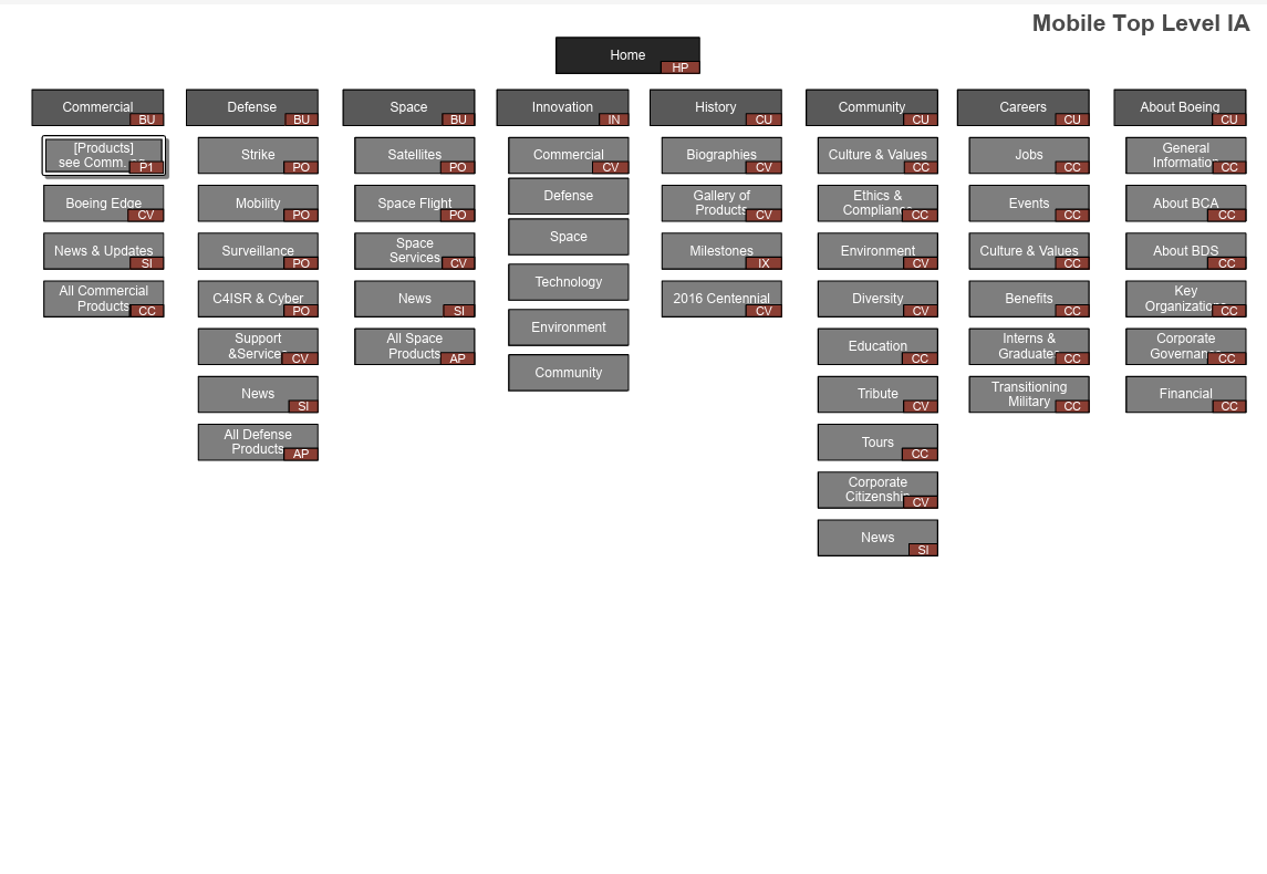
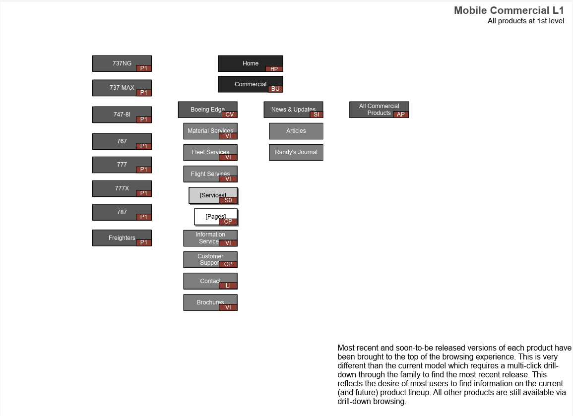
The mobile IA is documented in the gallery below alongside the desktop structure: two parallel architectures reflecting fundamentally different editorial positions for the same site.
Mobile Content Strategy
The IA work didn’t stop at desktop. Boeing.com was built as a fully responsive site, and that decision shaped the design work from the beginning: every structural and content decision had to hold up across breakpoints, not just on a large screen. But responsive implementation alone doesn’t answer the harder question of what content should actually appear on mobile, and in what order. Boeing.com serves fundamentally different audiences, and those audiences behave very differently depending on what device they’re on. Usage data and user interviews with Boeing made the pattern clear: mobile visitors were overwhelmingly current-events oriented. They were checking news, tracking product updates, and following announcements. Desktop visitors were researchers: investors reading annual reports, educators digging into history, suppliers navigating procurement content, business customers doing deep product comparisons.
That difference in intent drove a separate, fully developed mobile IA alongside the desktop structure. It wasn’t a simplified version of the desktop. It was a different editorial position entirely.
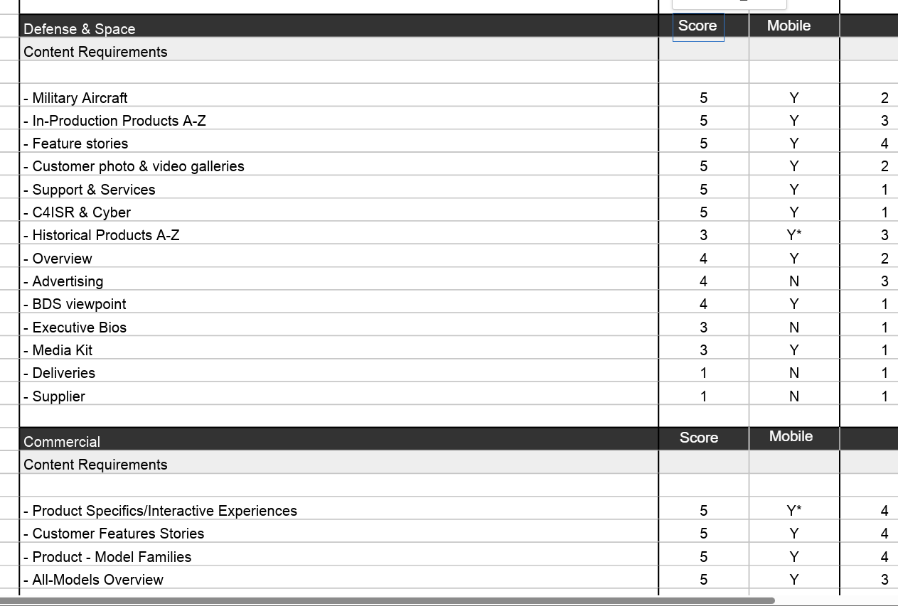
Content decisions were made page by page and content type by content type against a gap analysis matrix that scored every item for both the Boeing web team and for mobile specifically. Executive biographies, annual reports, supplier content, Frontiers Magazine, and employee and retiree sections all received explicit mobile exclusions. Product pages, current news, feature stories, military aircraft content, and customer highlights were all confirmed for mobile delivery. The criteria wasn’t whether content was important. It was whether a mobile user, in their likely context and with their likely intent, would benefit from it.
Within individual pages, the same logic applied at the component level. Content that required significant download weight, including large media assets, deep interactive experiences, and document downloads, was deprioritized or deferred on mobile to address real-world performance constraints. The goal was to make sure that what loaded first on a mobile device was what a mobile user was most likely there to find.
The result was a mobile IA that mirrored the desktop structure at the navigation level while making meaningfully different choices about depth, content sequence, and what earned a place on the page at all.
Design Approach
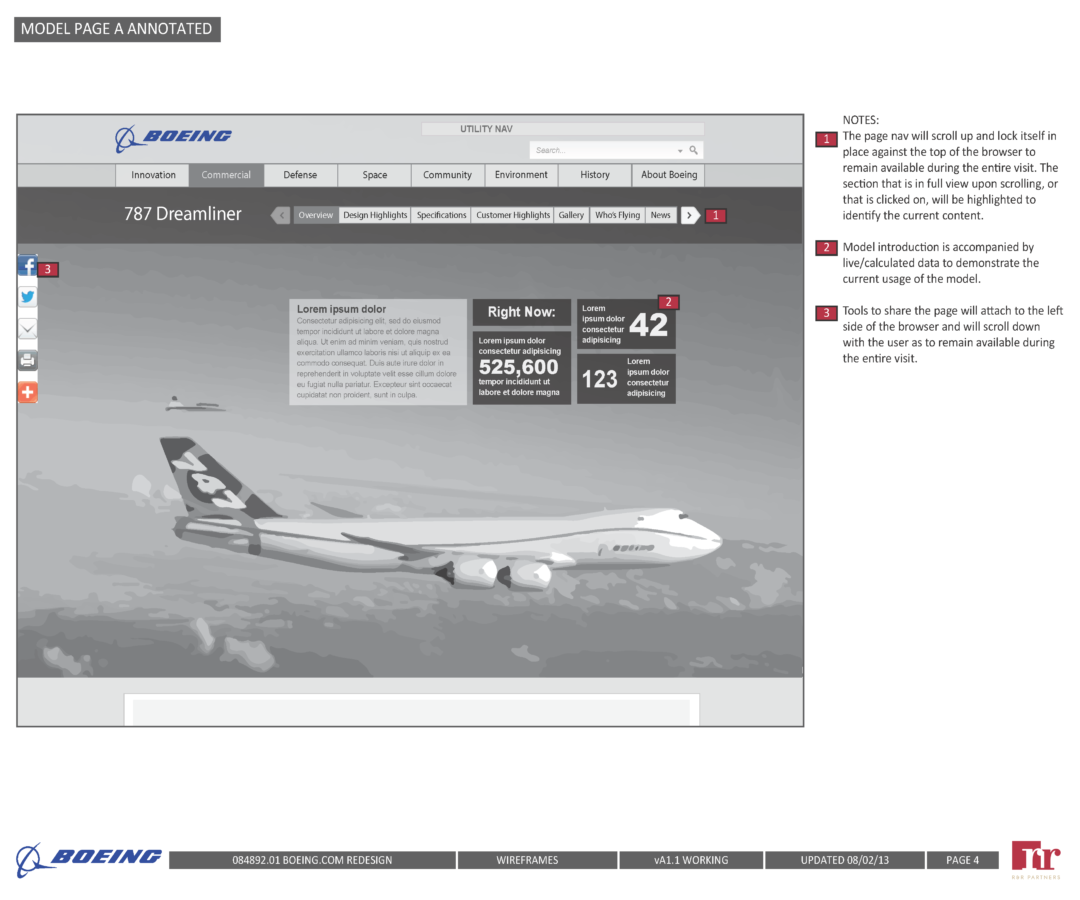
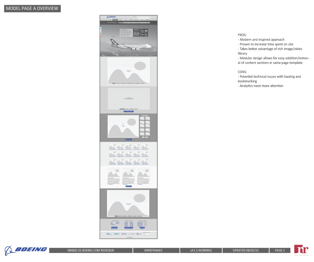
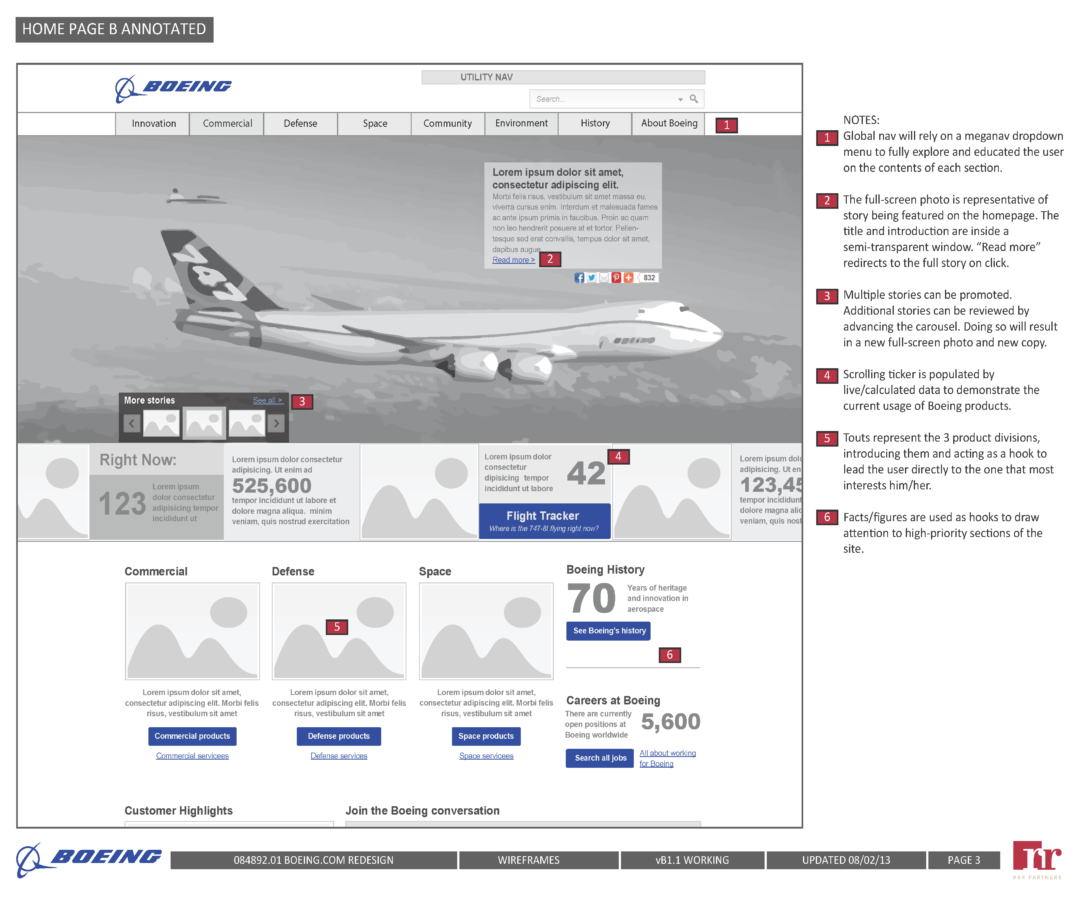
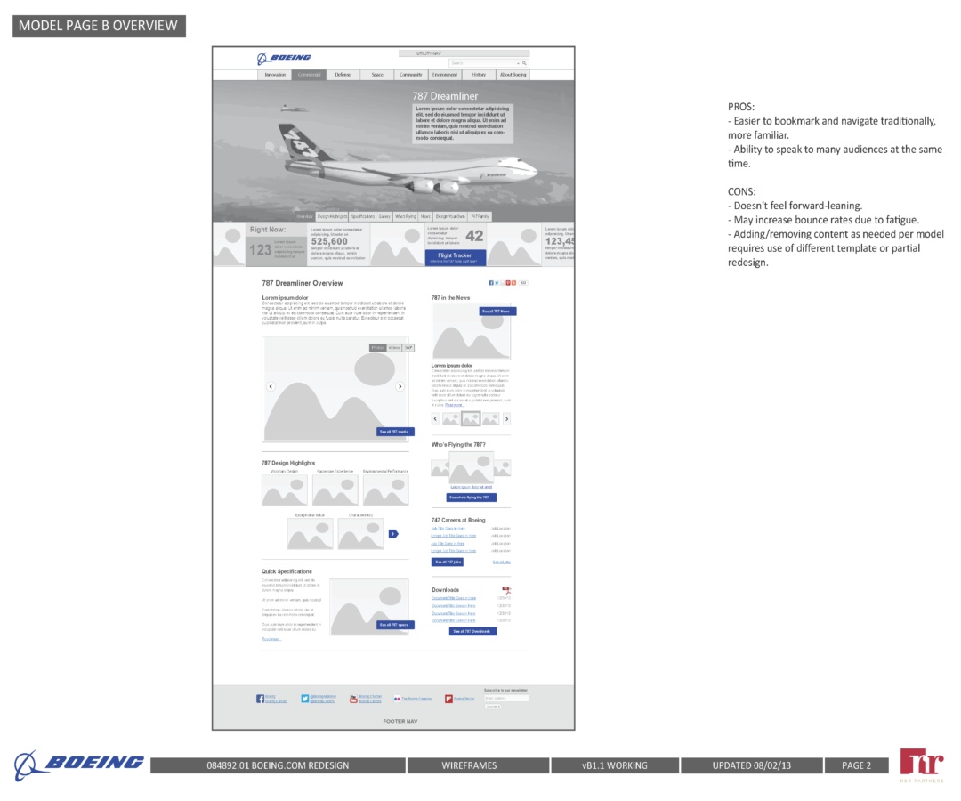
We developed two distinct design directions in parallel, both at the wireframe and visual level, to give Boeing a meaningful choice rather than a single take-it-or-leave-it recommendation. Each direction reflected a different set of tradeoffs in how content was prioritized and how the brand was expressed. Interactive wireframes were used to validate interaction models before visual design was applied, keeping the two concerns appropriately separate.
User flows were developed for the site’s highest-priority paths: product model pages, customer feature stories, and military aircraft content. These were the pages that mattered most to both Boeing and their audiences, and making them easily reachable from any point in the site was treated as a core structural requirement rather than a nice-to-have.
Results
The redesign moved the needle across every audience segment we designed for.
Paid media visitors spent 30 more seconds on site and bounced 15% less frequently.
Traffic to content about Boeing’s newer and innovative products increased by 50%.
Overall site traffic grew 15%, video views tripled, and Boeing moved from 38th to 7th in overall site experience rankings.
Investor visits tripled. First-time job seeker traffic increased 8%.
Those results span four distinct audience types, which is a useful reminder that good IA doesn’t just make things easier to find, it changes how people perceive and engage with a brand.
Recognition

W3 Award - Gold 2015
Website – Website Features – User Experience
W3 Award - Gold 2015
Website – Website Features – Visual Appeal

I was the sole UX designer on the project, leading all experience design work from research through final UI. The most demanding part of the engagement was the IA work: making principled decisions about 11,000 pages while keeping the rationale coherent enough to sell to a major enterprise client, and doing it in a way that held up under stakeholder scrutiny and user testing.
The mobile content strategy added another layer of complexity to that work. It required treating mobile not as a technical constraint to solve after the fact, but as a separate editorial problem with its own audience logic, its own content hierarchy, and its own definition of what a successful page looked like.
The internal reorganization Boeing undertook in response to the new IA wasn’t something we anticipated. It reflects what can happen when structural thinking goes deep enough to illuminate something the client didn’t know they needed to see.