Overview
This project ran in two phases.
Phase 1 started without a product owner, without a research function, and without an engineering team. That was an intentional strategic decision by our design director: advance the project through discovery and design while engineering was committed to other priorities. I operated as lead designer, surrogate researcher, and de facto product owner for the first phase.
Phase 2 began when a new product owner joined and ran fresh discovery across Customers, Loyalty, and Marketing together. What she found changed the scope: the loyalty and messaging tools weren’t just underused, they were on legacy systems that needed migration, and the loyalty program was out of compliance. The brief expanded from surfacing existing tools to actually fixing them. Engineering was in the room from day one of Phase 2.
I completed the dashboard and customer detail work toward handoff, and I directed a direct report through the loyalty, feedback, and messaging redesigns.
Growth design was central to both phases. The brief was specifically about retention, upgrade conversion, and making a subscription feel worth paying for, not just usability improvement.
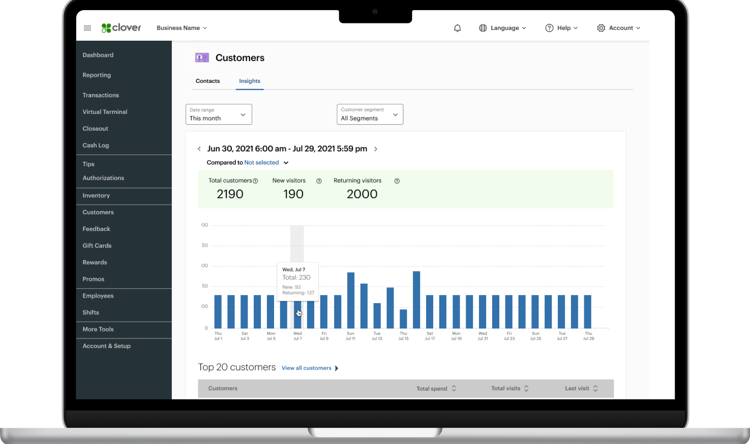
Clover Customers original design
Context
Clover’s merchant base skews toward small business owners who don’t have time for analytics. They need the product to surface the right information at the right moment and make the next action obvious. The Customers section wasn’t doing that. Loyalty, feedback, and messaging tools existed but lived in silos, and engagement with all three was low for a paid subscription.
The ask was a dashboard. The real problem was coherence, not features. The Customers dashboard was designed as a desktop-primary tool, built responsively as a baseline requirement: merchants managing their customer relationships are typically at a workstation, not a phone. The Loyalty tools carried a different requirement entirely, as the consumer-facing loyalty experience lived inside the Clover mobile app as responsive web views, making mobile-first design a core constraint for that surface rather than an afterthought.
The brief also required designing two subscription tiers: a base tier that had to feel genuinely valuable on its own, and an upgraded tier with a real reason to exist. One without the other breaks the upgrade story.
STAKEHOLDERS
Internal: Product owners of Customers, Marketing, & Loyalty programs.
Users: Merchant managers, Employees, and their Customers.
Discovery
Discovery pulled from three parallel streams: support channel feedback, in-app behavioral data, and competitive analysis.
The finding was consistent across all three: merchants wanted to act on their data, not just see it. The tools to act were already there. The path to them wasn’t.
The IA decision
The hardest single call was where the dashboard and customer detail pages should sit relative to the tools they connected to. I used AI-assisted structural modeling to pressure-test both approaches against merchant mental models. One session to reach alignment, rather than multiple rounds of opinion-based debate.

Insights and analytics
Giving merchants competitive context without exposing competitor data required aligning design, engineering, legal, and product on what “anonymized” actually meant at every layer. The result: merchant performance benchmarked against similar nearby businesses, which became the clearest reason to upgrade.
DESIGN DIRECTION
Three pillars anchored every design decision in Phase 1:
Integrated: The dashboard should be a starting point for action, not a reporting surface. Loyalty, feedback, and messaging should be reachable from within a customer’s record, not buried in separate navigation.
Customer-empowered: End customers needed real control over what merchants knew about them, per merchant, per channel, per message type.
Merchant-empowered: The base tier had to justify its cost before asking anyone to upgrade. The upgrade had to offer something genuinely unavailable elsewhere: merchant performance benchmarked against similar nearby businesses.

Designing With and For AI
As a research surrogate
Phase 1 had no research function. I structured AI prompts to model merchant and payment processor perspectives, giving me directional signal quickly enough to move design decisions forward. Every output was pressure-tested against support channel data and competitive analysis before it influenced anything. It wasn’t ground truth. It was a starting point I could validate.
As a product differentiator
The design vision for the Customers area included an insight layer that would move beyond charts: not just “here’s what happened” but “here’s what to do about it.” At the time, AI was the mechanism that made delivering that guidance at scale realistic, and it would have been a genuine market differentiator. Legal and security cut it during review. Data leaving the system was a risk they weren’t willing to carry, and in-house models were cost-prohibitive. We replaced it with comparative analytics and smart aggregation, which delivered similar value without the dependency.
That cut was consequential, not just a feature removal. It changed what the product could claim. Knowing the difference between a feature and a strategic capability is part of the job.


Phase 2: Design Leadership
When the new product owner ran fresh discovery, she found that the loyalty program wasn’t just underperforming: it was out of compliance with messaging consent standards and behind competitors on features customers expected. Enrollment flows were inconsistent across platforms, creating measurable drop-off. The messaging control model was too blunt: one toggle for all message types, all merchants, both channels.
The fix required two things: streamline enrollment across all surfaces to reduce friction, and give customers granular control. Separate opt-in for operational messages (receipts, invoices) and marketing messages (promos, rewards), per channel (email and SMS), per individual merchant. That’s a more complex system. It’s also a fundamentally more honest one.
The mobile context made that control model more consequential, not less. Consumer-facing loyalty enrollment and messaging preference flows ran as responsive web views inside the Clover app, meaning they had to function correctly and feel native at mobile sizes. Enrollment friction that might be tolerable on a desktop form becomes a conversion killer on a small screen. The granular opt-in model my direct report designed had to work at every breakpoint, with touch targets, form layout, and confirmation states all validated for mobile use before the desktop treatment was considered complete.

Before: One combined opt-in for all merchants, all message types, email only.

After: Separate control for operational and marketing messages, per channel, per merchant.
Directing the work
I stayed on the dashboard and customer details, completing that work toward engineering handoff. The loyalty, feedback, and messaging redesigns went to my direct report. He didn’t start from a blank canvas. He started from the IA, the design direction, the interaction model, the validated data architecture, and a constraints doc capturing every Phase 1 decision and the reasoning behind it. The constraints doc explicitly called out the mobile-first requirement for the loyalty and messaging surfaces, including the responsive web view context and the enrollment conversion implications at small screen sizes, so he had the full picture before touching a frame.
Weekly design reviews. Problem-solving when he hit walls. Walking through edge cases and engineering alignment together. Present enough that he wasn’t blocked, hands-off enough that the work was genuinely his.
Engineering in the room
Phase 2 ran as a fully collaborative model from the start. Feasibility checked before direction locked. Data structures validated before designs were finalized. Edge cases surfaced before handoff. That’s my default model when I have the full team available.
Results & impact
The loyalty updates launched first. Three months post-launch:
%
LOYALTY TRANSACTIONS PER MONTH
%
NEW LOYALTY MEMBERS PER MONTH
Those numbers came from two specific fixes: reducing enrollment friction across platforms, and giving customers meaningful control over what they received and from whom. The dashboard and customer details are in active development. Feedback and messaging tools are queued behind them. The unified data model, IA, and interaction patterns established in Phase 1 carry forward into all of it.


Phase 1 (IC Execution)
Led design end-to-end without a product owner, research function, or engineering team. Took on discovery, user story definition, IA, flows, and high-fidelity design as a solo function. Every deliverable was done before the team existed.
Phase 2 (Design Leadership)
Directed a direct report through the loyalty, feedback, and messaging redesigns while completing the dashboard and customer detail work in parallel. Documented design rationale clearly enough that someone else could execute without losing the intent. Navigated competing stakeholder priorities between two product owners without direct authority to resolve them.
Methods and tools: Lead UXD | User Research (surrogate methods) | Functional and Content Requirements | Information Architecture | User Flows | UI Design | Responsive Design | Mobile-First Design (Loyalty) | Cross-functional Stakeholder Alignment | Growth Design (retention and upgrade conversion)
Lead UXD
User Research
Functional & Content Reqs
IA
User Flows
UI Design
Learnings
Three things I’d carry into any similar engagement:
AI ambition needs a funded path. We designed a market-differentiating insight layer that couldn’t survive legal and security review. What we built without AI ended up more defensible. The lesson isn’t to avoid AI, it’s to validate the infrastructure dependency early.
Integration debt is a design problem. Multiple legacy systems with no shared customer record make seamless experiences structurally impossible. That has to be funded as a prerequisite, not treated as a constraint to design around.
Foundation work is the handoff. In Phase 2, the most important thing I gave my direct report wasn’t a brief. It was the IA, the design rationale, and the constraints doc. That’s what made direction possible without being in every room.