Overview
Most destination marketing is built for people who are already planning a trip. GeoVegas was designed for a different audience: people who hadn’t decided yet.
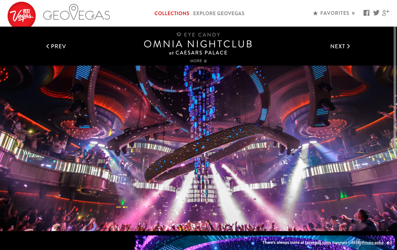
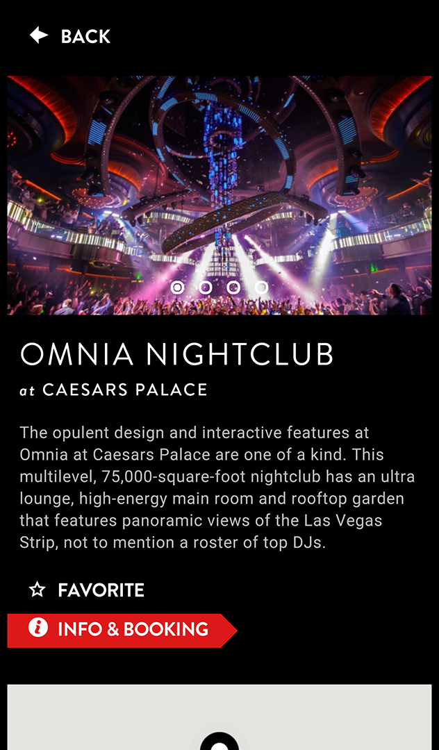
The site is an immersive, visually driven journey through curated Las Vegas experiences, using large-format photography, video, Google Interiors-style walkthroughs, and 360 video to let visitors virtually experience the city’s best restaurants, shows, clubs, and attractions before booking anything. It was conceived as a deliberate complement to LasVegas.com, which serves mid-to-lower funnel visitors who are already in research or booking mode. GeoVegas lived further up the funnel, doing the work of turning curiosity into intent.
The Design Problem
The challenge with an experience like this isn’t building the technology. It’s making the editorial decisions that determine whether the experience feels curated or random, aspirational or generic.
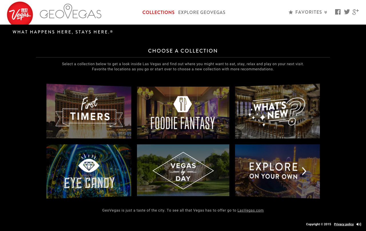
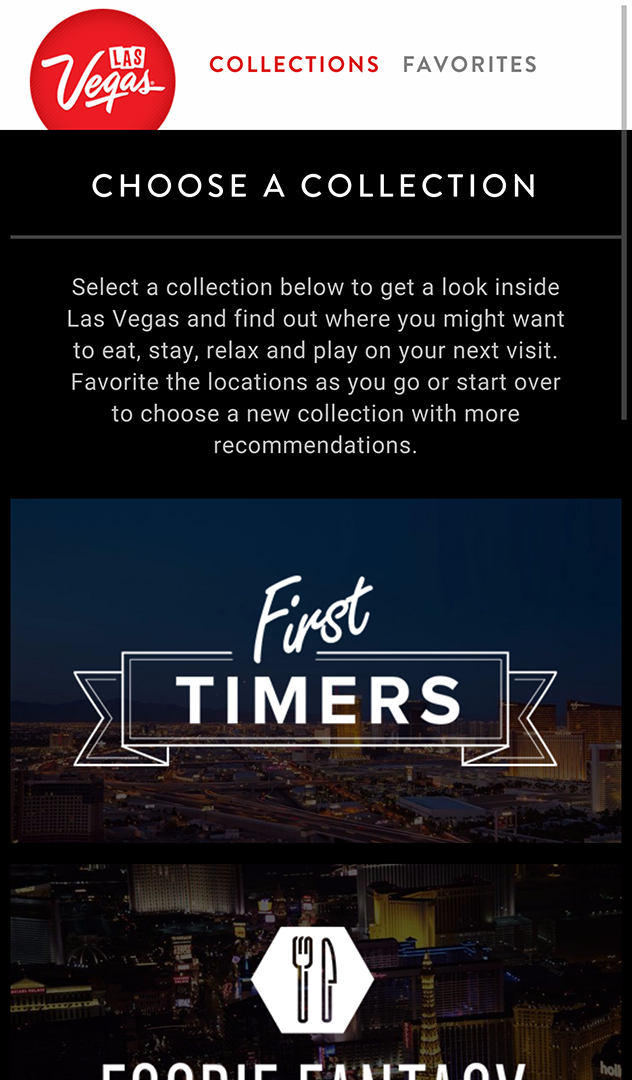
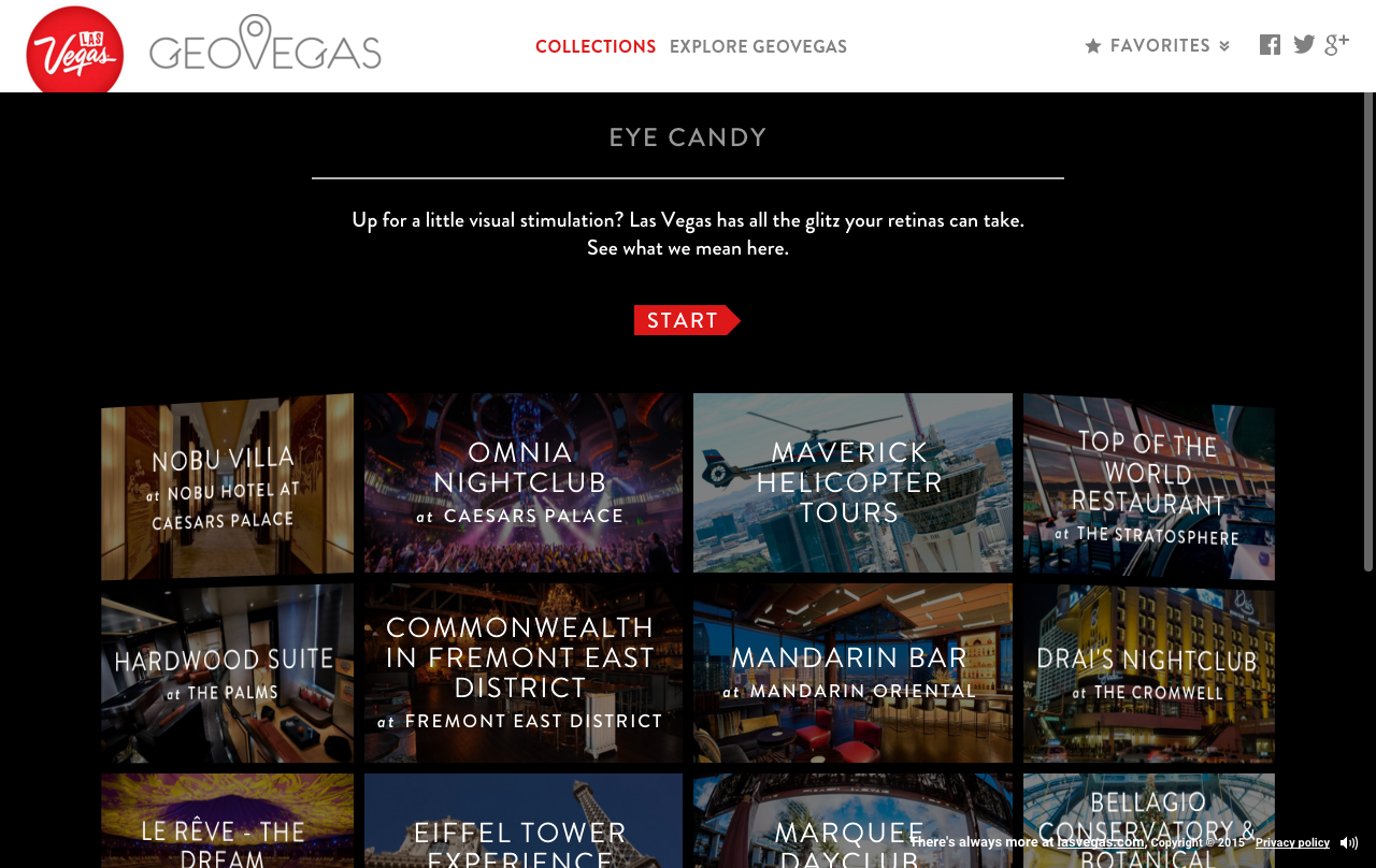
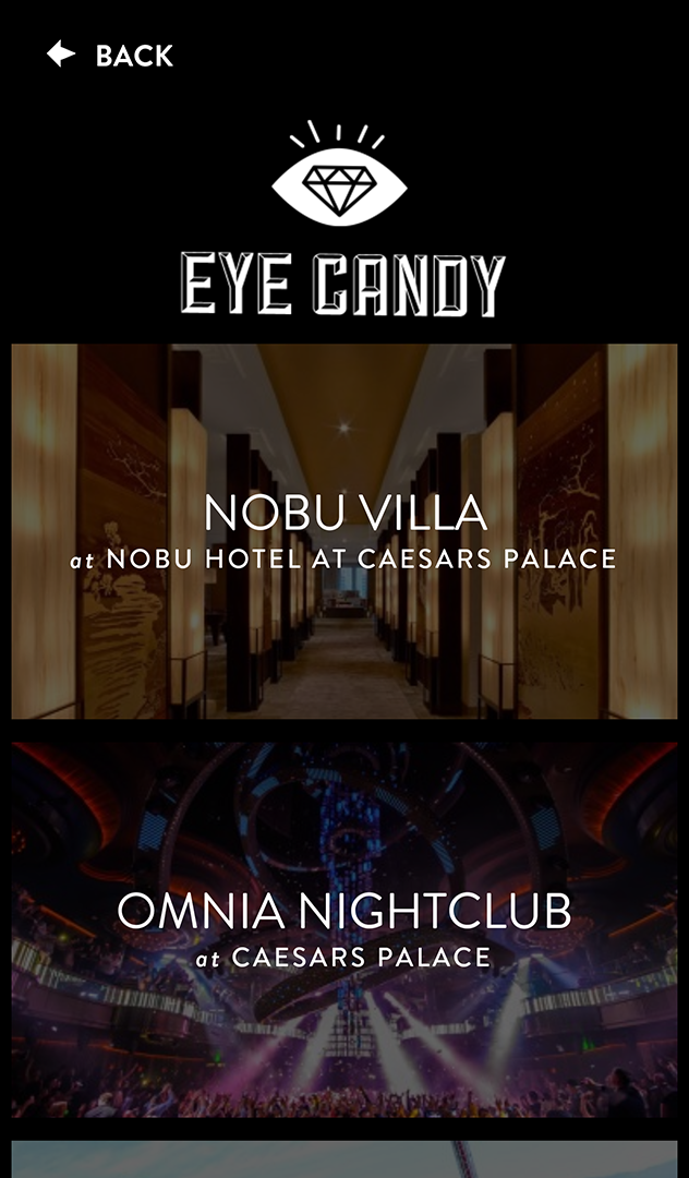
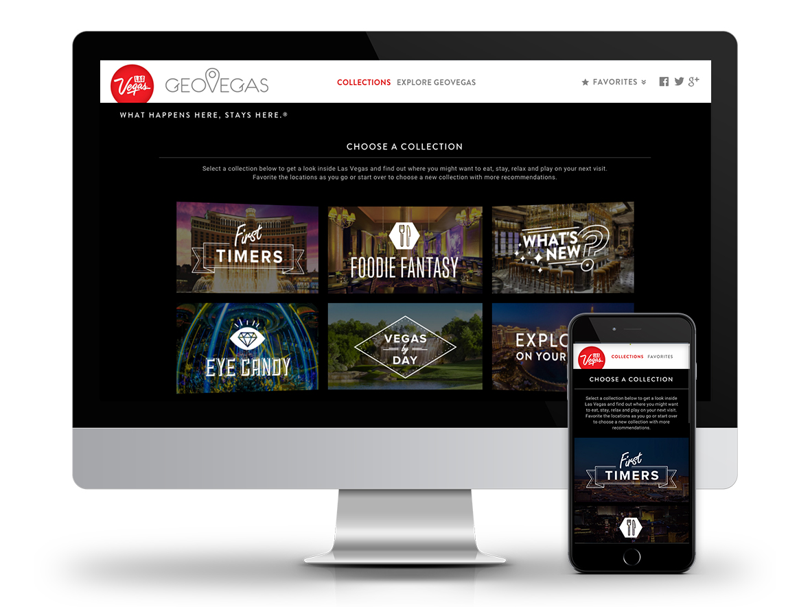
Las Vegas has thousands of venues, experiences, and attractions. GeoVegas featured 60, organized into five collections. Every choice about what to include, what to leave out, and how to group experiences carried real consequences for how the site felt and who it spoke to. A collection that felt arbitrary would undermine the immersive quality the whole experience depended on. A collection that felt too narrow would exclude the visitors most likely to be moved by something they hadn’t considered.
Getting that right wasn’t a one-time decision. It was an ongoing design problem.
Curation as a Design System
Because the site was built around a constrained, high-quality set of experiences rather than comprehensive coverage, the process of selecting and arranging locations had to be systematic rather than editorial. We used card sorting exercises each time locations were added or removed, involving real users in the decision about which experiences belonged together and how they should be sequenced within a journey.
That approach kept the collections grounded in how visitors actually think about Las Vegas rather than how the client or the agency would organize it internally. The result was five collections that felt coherent and distinct, each one telling a different version of what a trip to Las Vegas could be.
Optimization Over Time
The site wasn’t treated as a launch-and-leave project. User feedback and analytics drove over a year of ongoing optimization, with each iteration improving against the KPIs we were tracking. Return visits were consistently high, and time on site exceeded LasVegas.com, which is a meaningful benchmark given that the main site serves visitors with much higher purchase intent.
That sustained engagement reflects something important about the design: when the experience itself is the product, the metrics look different from a transactional site. Users weren’t completing tasks. They were spending time.
Created at R&R Partners for LVCVA
Impact
Preliminary testing showed a roughly 35% increase in visitors seriously considering a Las Vegas trip after using the site. For an upper-funnel experience whose entire purpose is to move people from passive interest to active consideration, that number is the point.
Users averaged over five minutes on site, with most completing more than one full journey through the experience.
I led UX on the project, responsible for IA, the overall experience architecture, user testing, and ongoing analytics and iteration. The curation framework was one of the more interesting problems I worked on: building a repeatable, user-informed process for making editorial decisions at a product level, rather than leaving them to gut instinct or client preference.