
LasVegas.com
Destination Marketing to Booking Platform: UX Strategy, Mobile Redesign, and Conversion OptimizationOverview
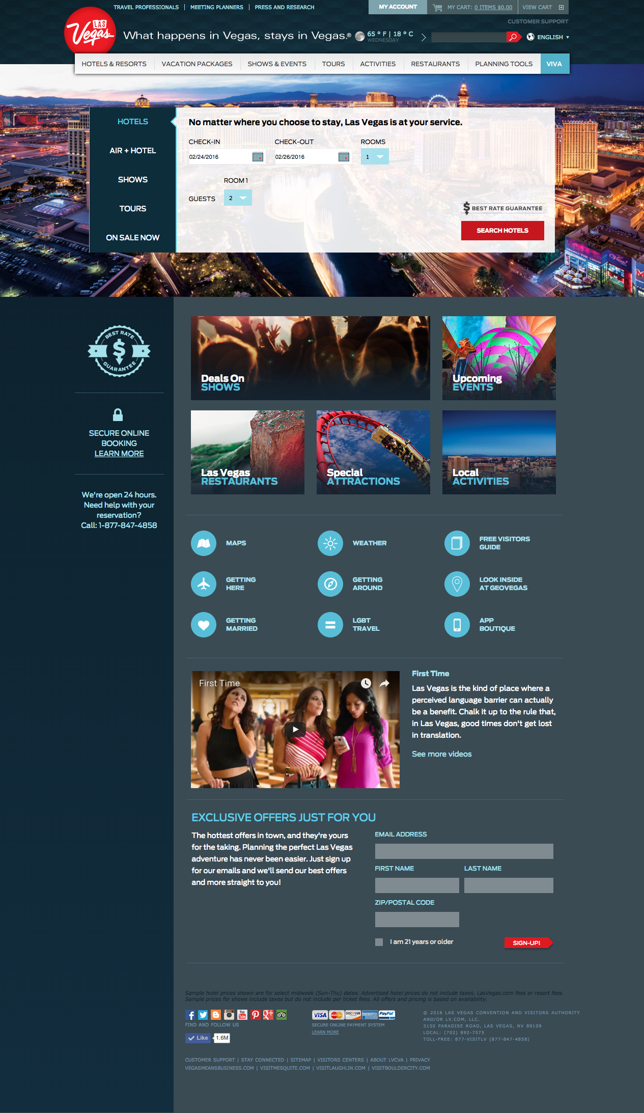
LasVegas.com sits at a genuinely difficult intersection, and it got there through transformation rather than design. The site began as a pure destination marketing property: discovery, inspiration, and audience engagement for Las Vegas visitors. The addition of a third-party booking platform partnership changed everything. What had been a marketing site became a hybrid experience where the same visitor who arrived for inspiration needed a seamless path to book a hotel room, reserve show tickets, or purchase a vacation package without ever feeling like they’d left the destination brand.
That transition from marketing site to booking-enabled platform is the context for everything that followed. The optimization work wasn’t improving an existing ecommerce experience. It was building and then refining a conversion layer that hadn’t existed before, on top of a site designed for a fundamentally different purpose. Balancing destination storytelling with transactional clarity, on a site averaging 1.3 million monthly visits, is an ongoing design problem rather than a one-time solution.
This project covered two parallel workstreams: a full mobile-first responsive redesign to bring parity and optimization to an audience that had been underserved on that platform, and continuous desktop optimization driven by analytics and user feedback as the booking integration matured.
Created at R&R Partners for LVCVA
The Mobile Gap
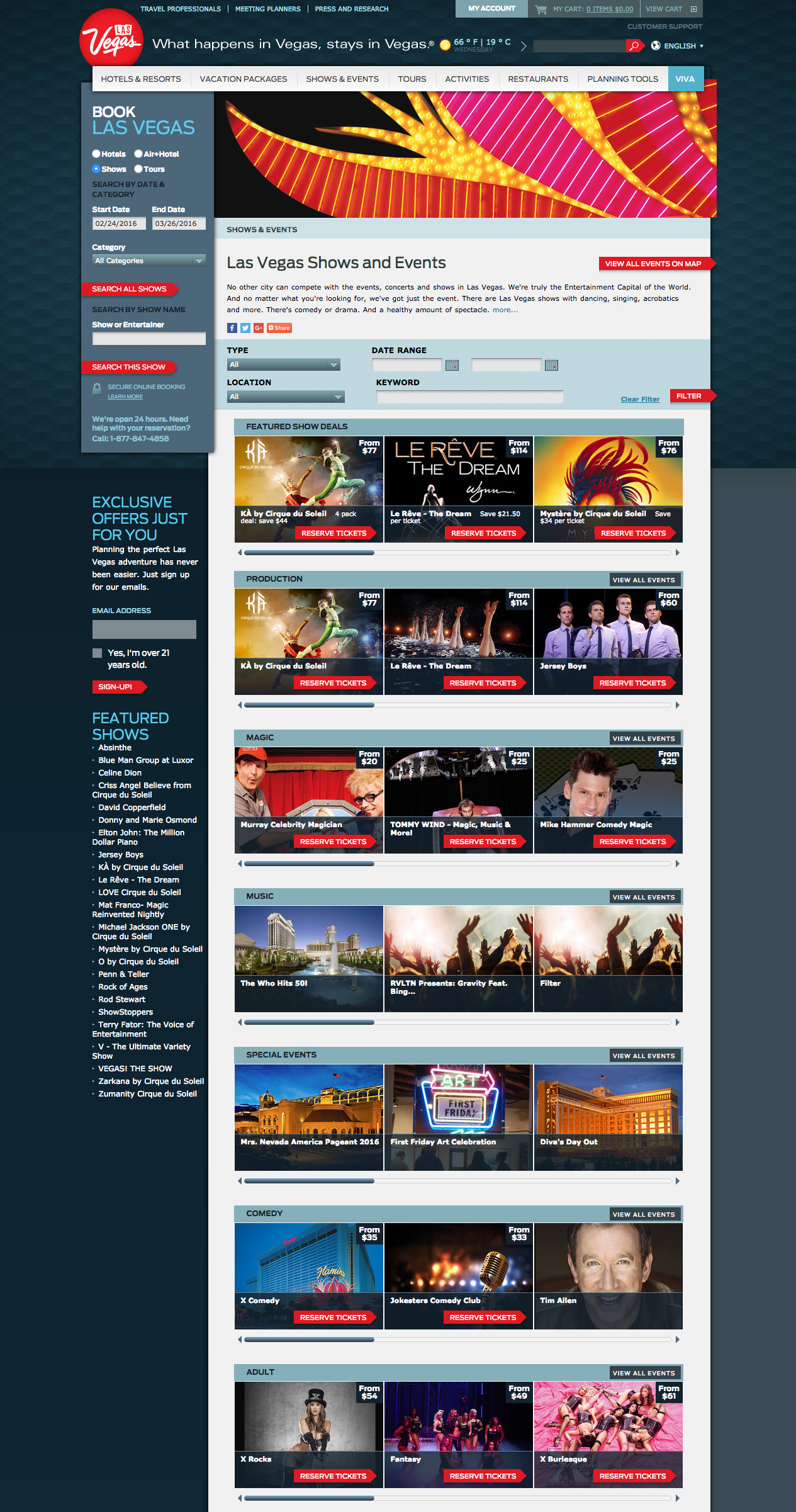
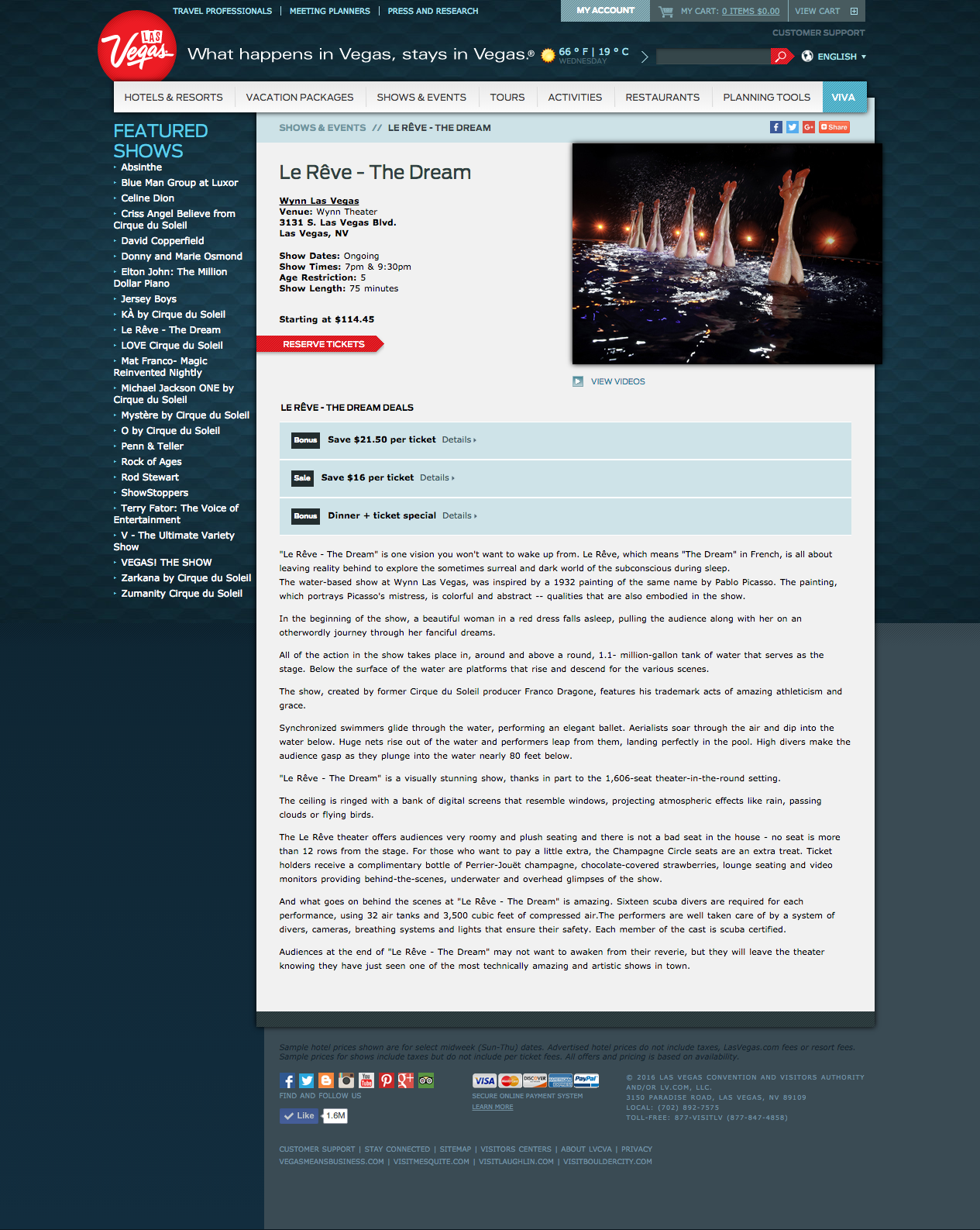
A significant portion of Las Vegas visitors were using the site on mobile devices, and there was no mobile-optimized version. The desktop site had the full range of functionality users needed: destination content, hotel search, show listings, booking integrations across multiple third-party systems. None of that translated well to small screens without deliberate redesign.
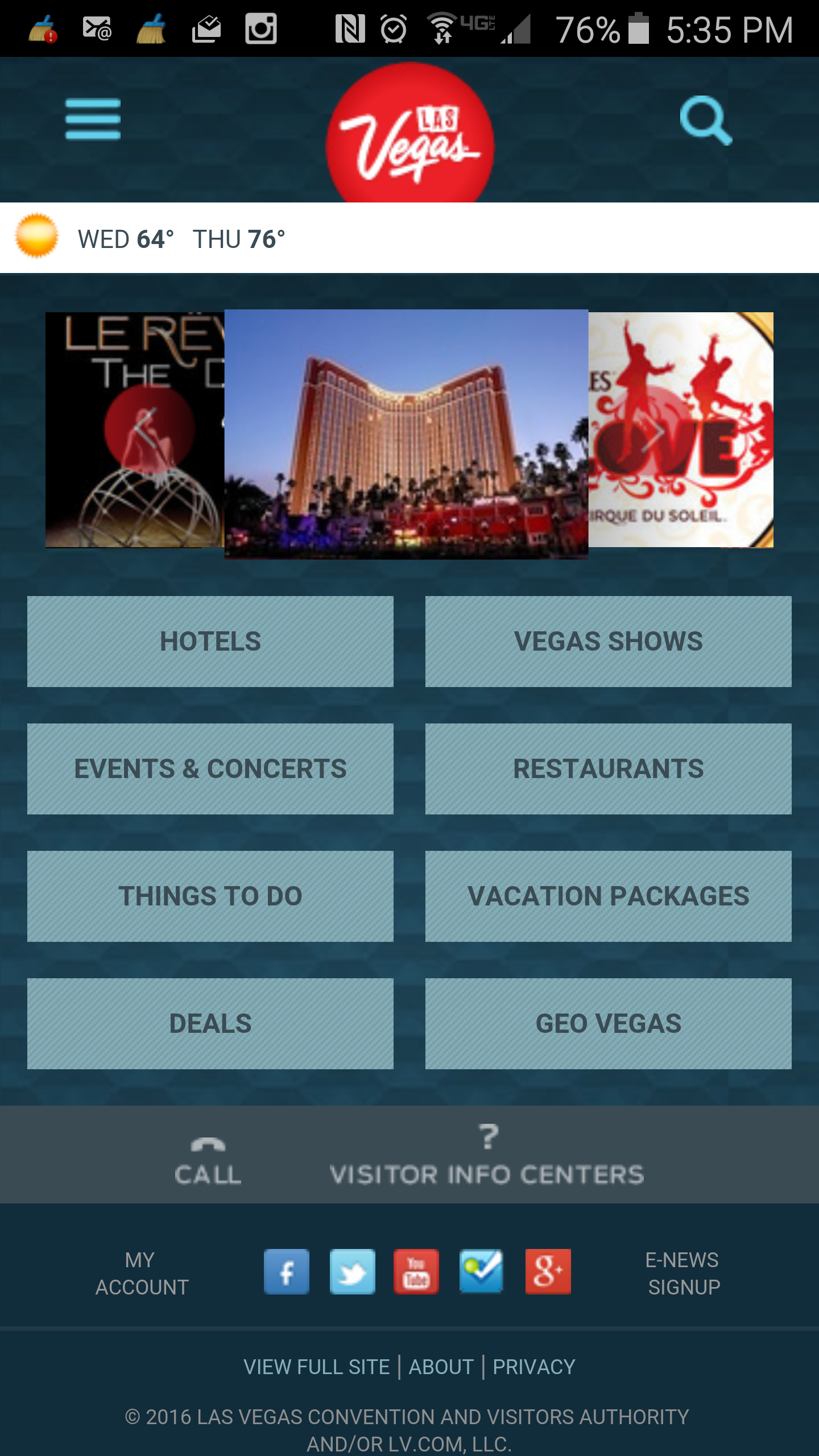
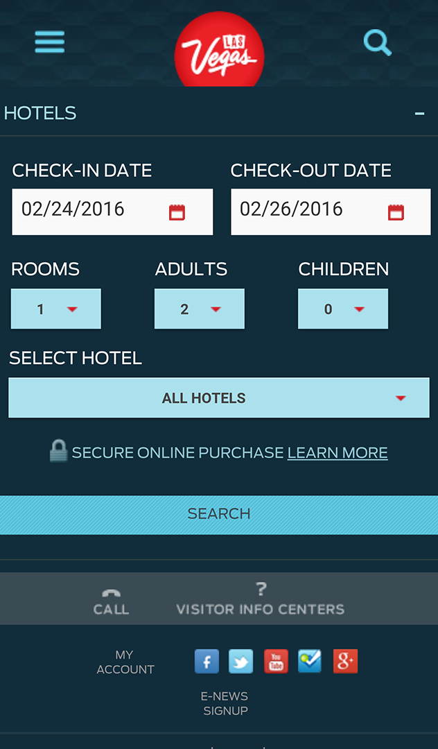
The mobile work wasn’t simply a responsive adaptation of the desktop site. The m.lasvegas.com build was a dedicated mobile-first responsive system, designed to accommodate both phone and tablet breakpoints with a layout and content hierarchy built from the smallest screen up. That approach required rethinking the architecture and navigation from the ground up for a context where users are more likely to be in-trip or close to a decision, attention is shorter, and the booking path needs to be even more direct. At the same time the full content depth of the desktop experience had to remain accessible, because Las Vegas visitors use the site at every stage of their planning process.
I led the IA simplification, designed user flows across multiple technical integrations with OTA booking partners, and produced site-wide wireframes for the mobile experience.
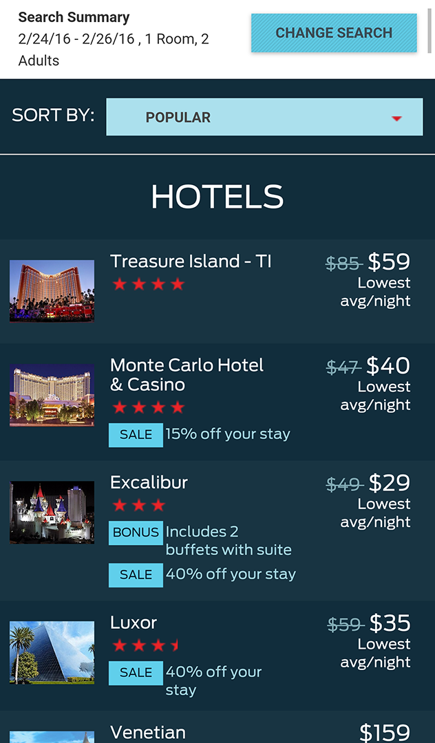
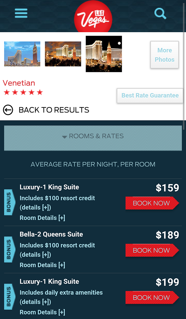
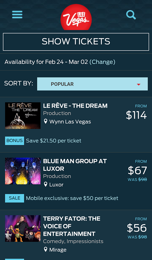
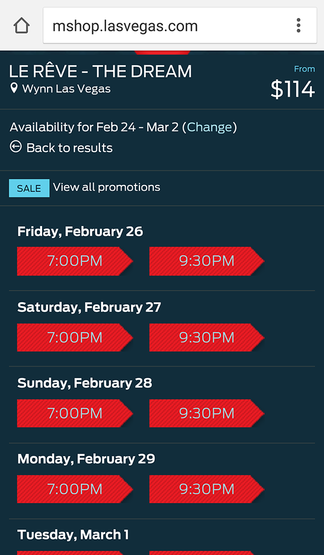
The Mobile Design Challenge
Designing for mobile on LasVegas.com meant solving two problems at once: an audience problem and an integration problem.
The audience problem was about context. Mobile visitors to a destination travel site aren’t sitting at a desk with time to browse. They are closer to a decision, more likely to be in-trip or actively planning, and less patient with friction in the path to booking. A heuristic evaluation of the existing desktop site identified a recurring pattern across every section: sidebars pulling users away from the primary task, competing CTAs with equal visual weight, and booking paths that required more clicks than the user’s intent warranted. Every one of those problems is more damaging on a small screen than a large one. A distracting sidebar on desktop is an annoyance. On mobile it is a task failure.
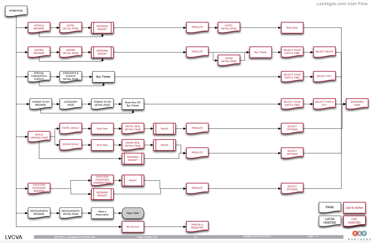
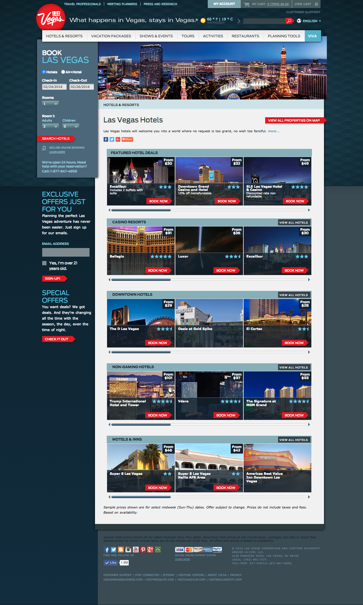
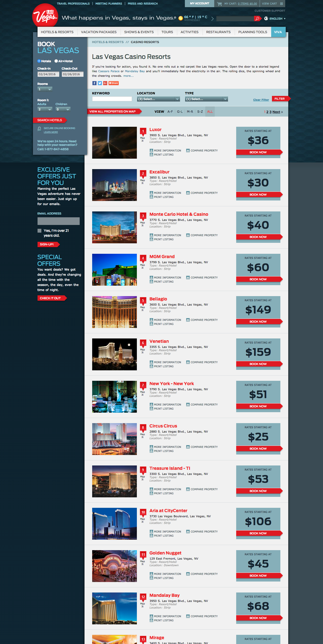
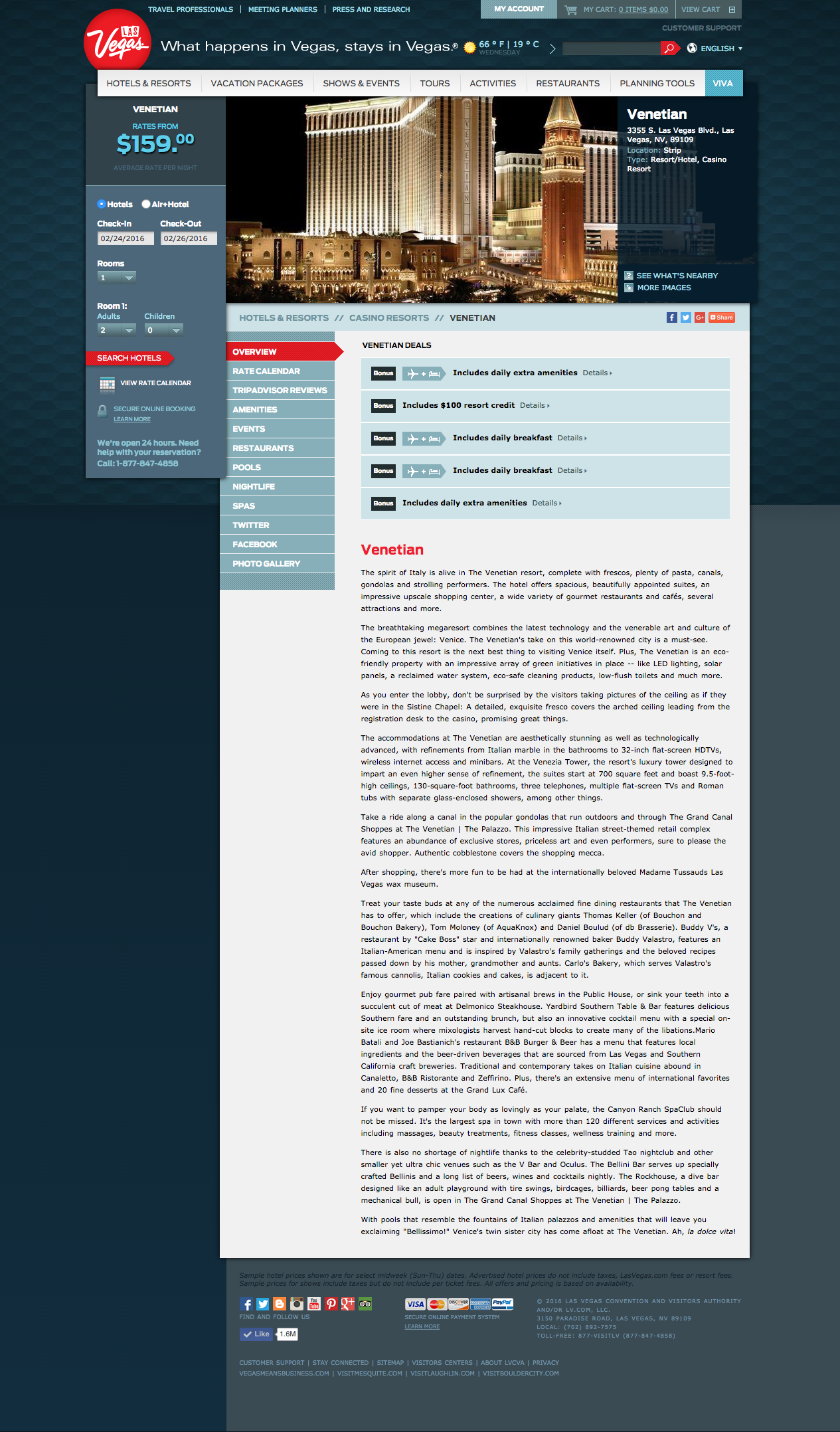
The integration problem was structural. LasVegas.com served as the front door to a booking experience that ran across multiple third-party OTA systems. Hotels, shows, vacation packages, restaurant reservations, and special events all handed off to different platforms at different points in the flow. On desktop, a user could absorb that complexity across a wider viewport with more visual context. On mobile, every handoff between LVCVA-hosted pages and partner-hosted booking surfaces had to feel continuous and intentional, because any moment of disorientation in a small-screen booking flow costs a conversion.
The mobile user flow was designed to address both. Navigation was simplified to prioritize the highest-intent entry points: hotels, shows, deals, and vacation packages. The booking widget was surfaced earlier in the flow and made the primary CTA at every stage where a user might be ready to commit. Sidebar content, flagged in the heuristic evaluation as a consistent distraction from task completion across every section of the desktop experience, was removed from mobile entirely. The path from browse to book was reduced to the minimum number of steps each OTA integration would allow. The responsive system was then designed to maintain that simplified hierarchy consistently across phone and tablet breakpoints, so the mobile-first logic held at every screen size rather than degrading at the tablet level.
Desktop Optimization
The desktop work was iterative by design. The team reviewed analytics and user feedback on a continuous cycle, identifying friction points, testing solutions, and measuring results. This kind of sustained optimization work is less visible than a launch but often more impactful: compounding small improvements on a high-traffic site adds up quickly.
The tension that defined most of the desktop work was the same one that defines the site overall: when a user is browsing hotel options or reading about shows, how much should the experience push toward booking versus letting them explore? Getting that balance wrong in either direction costs the client. Too aggressive and you interrupt the research phase and lose users before they’re ready. Too passive and you miss conversion opportunities from visitors who are ready to book but not finding a clear path to do it.
Impact
Booking widget searches increased from 20.5% to 27.3% over two years of iterative optimization, a nearly 7-point lift on a site doing 1.3 million monthly visits.
That kind of sustained movement in conversion behavior on a mature, high-traffic site reflects consistent, evidence-driven design work rather than a single big change.
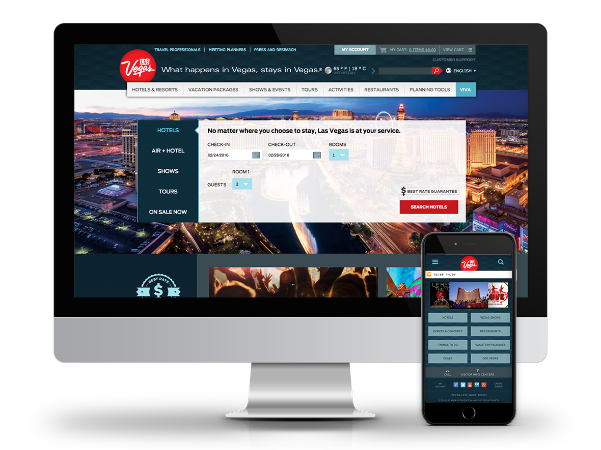
I led UX across both workstreams, covering IA, user flows, interaction design, UI, and ongoing analytics and iteration. The mobile redesign was the larger discrete project; the desktop optimization work was more continuous and required a different discipline: staying attentive to signal in the data, forming clear hypotheses, and executing changes with enough precision to learn from them.
The mobile work in particular required holding two competing priorities in tension throughout: simplifying the experience enough to serve a high-intent mobile visitor efficiently, while preserving enough of the full site’s depth to serve visitors at every stage of the planning funnel. Getting that balance right across six content categories and multiple OTA integrations, within a mobile-first responsive system covering both phone and tablet breakpoints, was the central design challenge of the project.