
Overview
Laughlin is one of several southern Nevada destinations represented by the LVCVA alongside Las Vegas. The VisitLaughlin.com site serves the same dual purpose as LasVegas.com: destination marketing and OTA referral bookings in one experience. But Laughlin is a meaningfully different destination, serving a meaningfully different audience, and the design had to reflect that rather than simply inherit patterns from the larger site.
I was the sole designer on the project, responsible for IA, interaction design, and UI across both desktop and a fully responsive mobile experience. The site was built responsively from the ground up, with layouts, navigation, and booking flows designed to adapt across desktop, tablet, and mobile breakpoints within a single system.
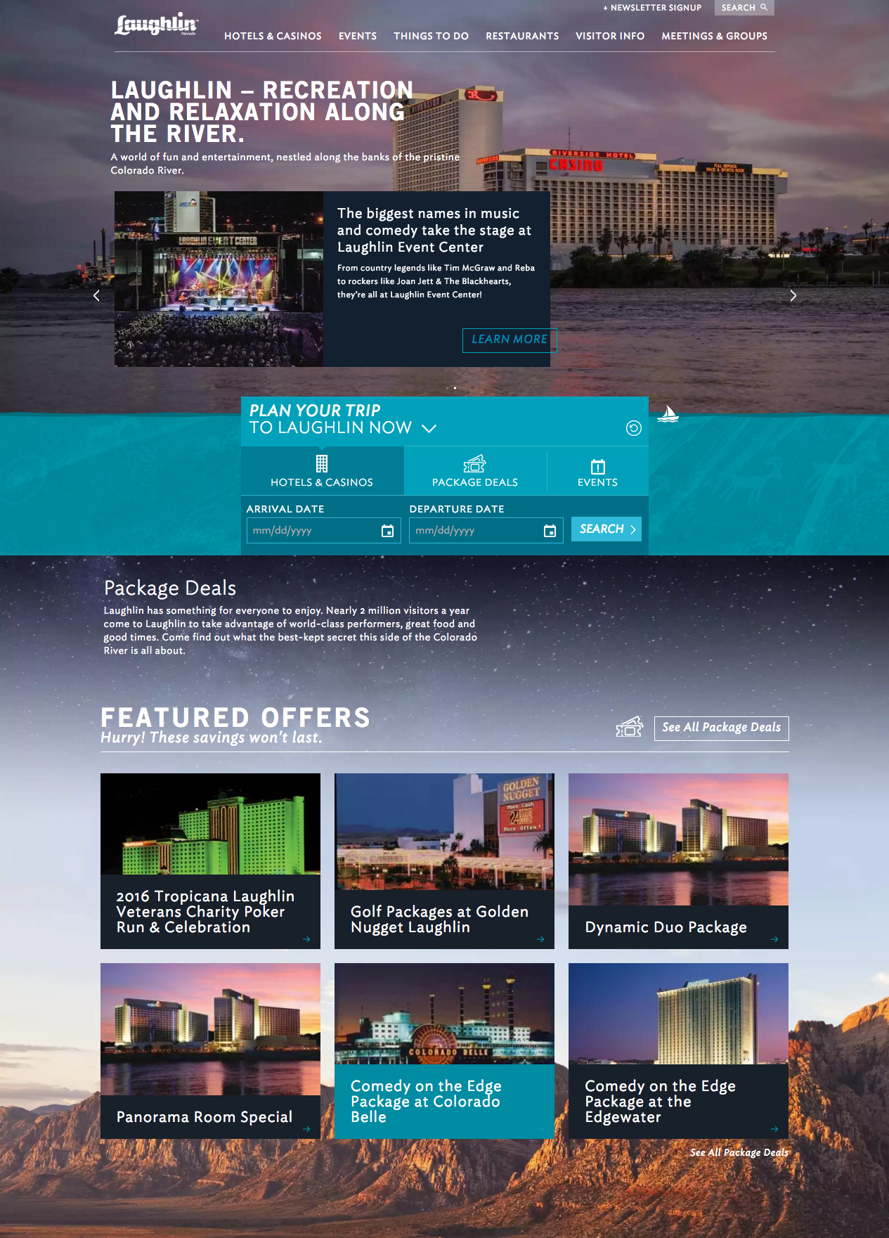
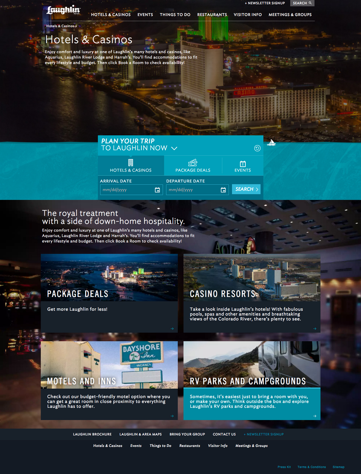
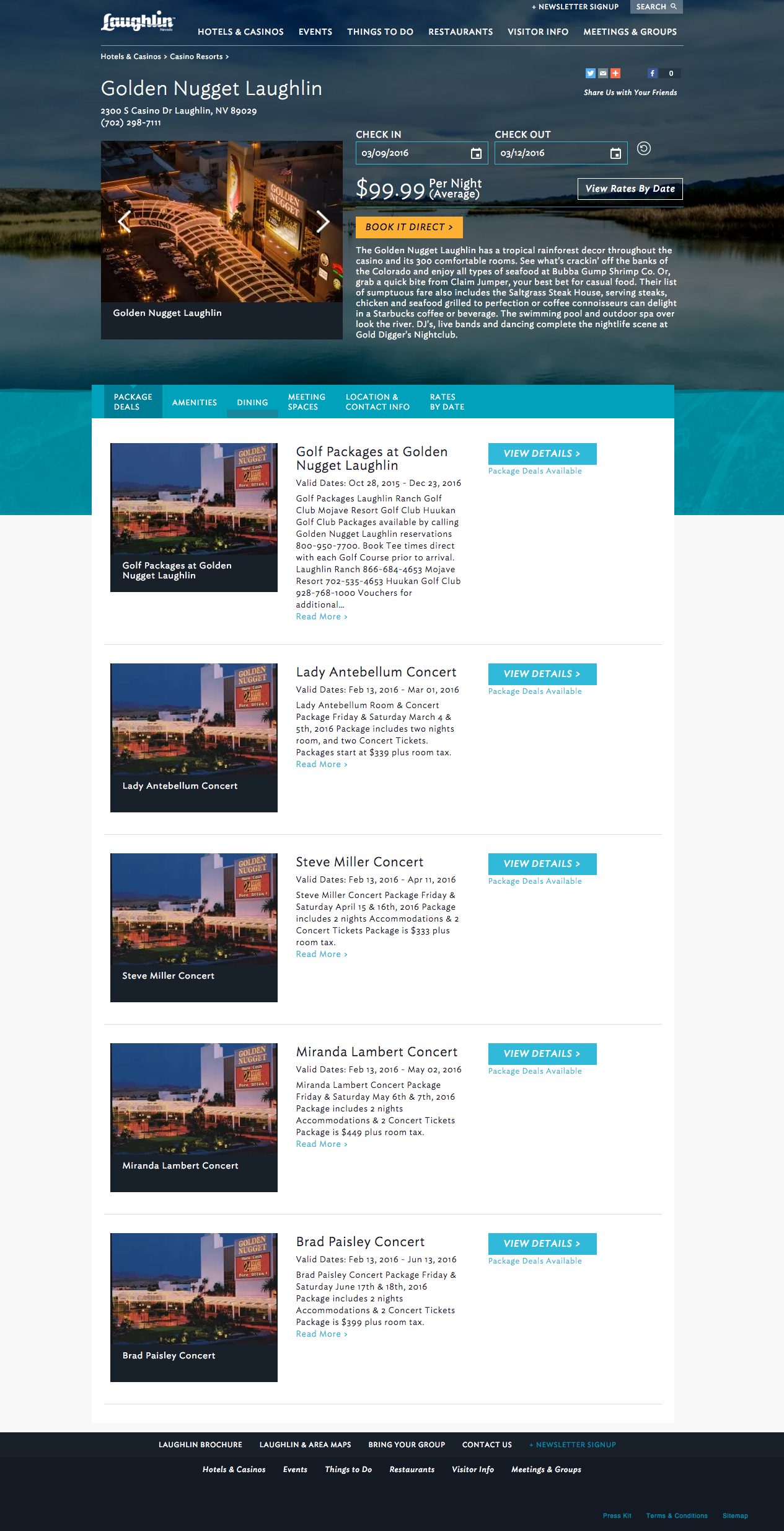
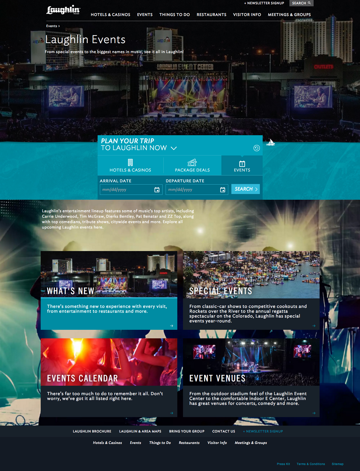



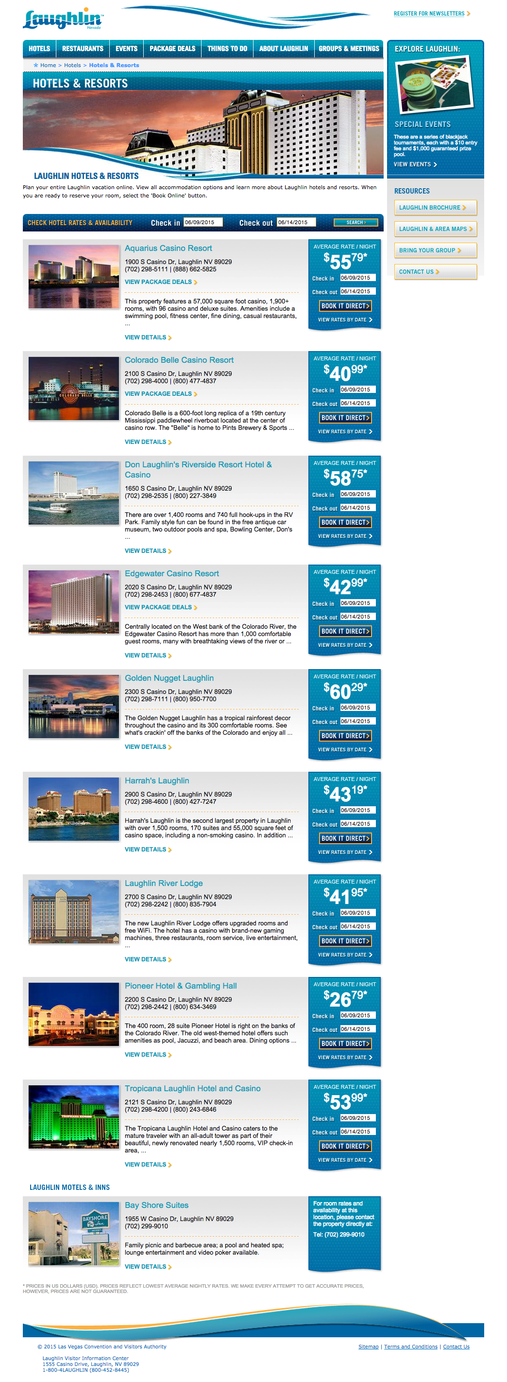
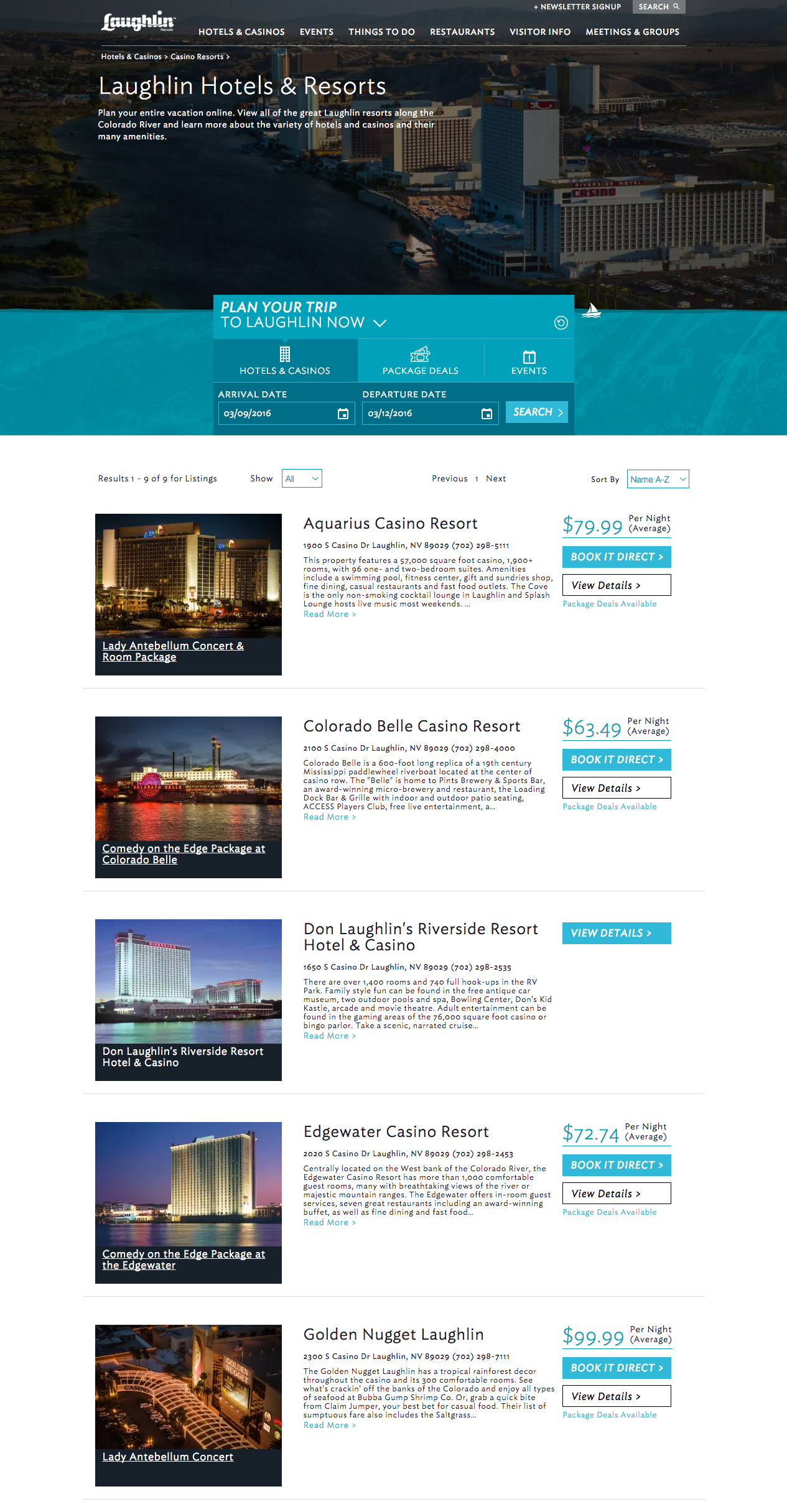
A Different Audience, A Different Problem
The visitors who choose Laughlin over Las Vegas are not the same people. The Laughlin audience skews older, more value-conscious, and more repeat-visitor heavy. They’re not looking for the overwhelming scale and spectacle of the Strip. They’re looking for a relaxed experience with a clear sense of what’s available and how to book it without friction.
That audience profile shaped nearly every design decision, including the responsive design approach. The inspirational content layer that plays a significant role on LasVegas.com matters less here. The inventory is smaller: fewer hotels, fewer shows, a more contained set of options. The funnel is shorter and more direct. Visitors tend to know what Laughlin is and arrive closer to a booking decision, which means the design needed to get out of their way faster than its Las Vegas counterpart. On mobile especially, where Laughlin visitors are often close to or already in-destination, that directness is not a preference but a requirement.
Adapting the System, Not Copying It
The structural approach drew from the same foundation as LasVegas.com: a DMO/OTA hybrid site with a similar information hierarchy, booking integrations, and content taxonomy. But applying that structure without adaptation would have produced a site that felt generic rather than considered.
The IA was updated to reflect the narrower inventory and more direct user intent. Navigation was simplified to reduce the overhead that makes sense on a larger site but creates unnecessary friction on a smaller one. The visual design was developed within Laughlin’s own brand identity rather than carried over from Las Vegas, finding a visual language that conveyed a different kind of appeal: laid-back, accessible, unpretentious.
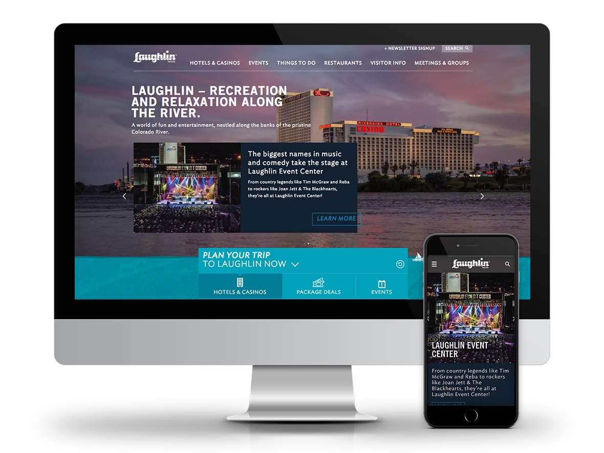
The responsive design system followed the same audience logic throughout. Rather than designing for desktop first and adapting down, the mobile breakpoints were treated as primary reference points for information hierarchy and booking path decisions, with the desktop layout expanding from that foundation. Laughlin visitors on mobile are often close to or already in-destination, looking for quick access to hotel availability, show times, and event details. Those use cases set the hierarchy for every breakpoint, not just the smallest screen. Sidebar content that appears contextually useful on a wide desktop viewport was removed or repositioned at narrower breakpoints to keep the booking path clear. The navigation was designed to collapse cleanly to a compact mobile pattern without losing access to the full content set.
Mobile Responsive Design
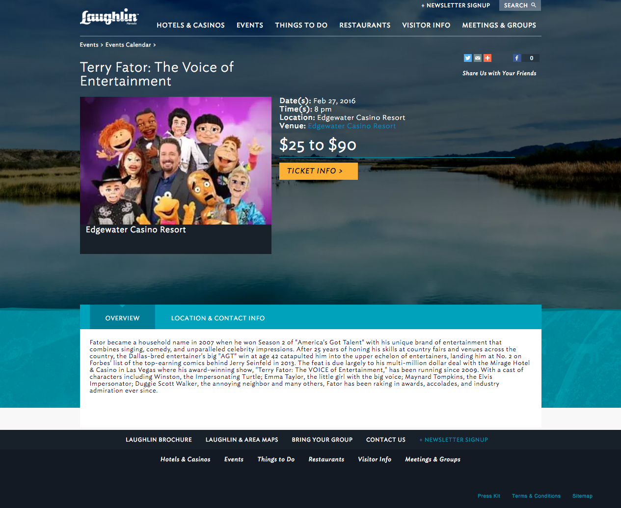
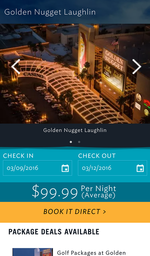
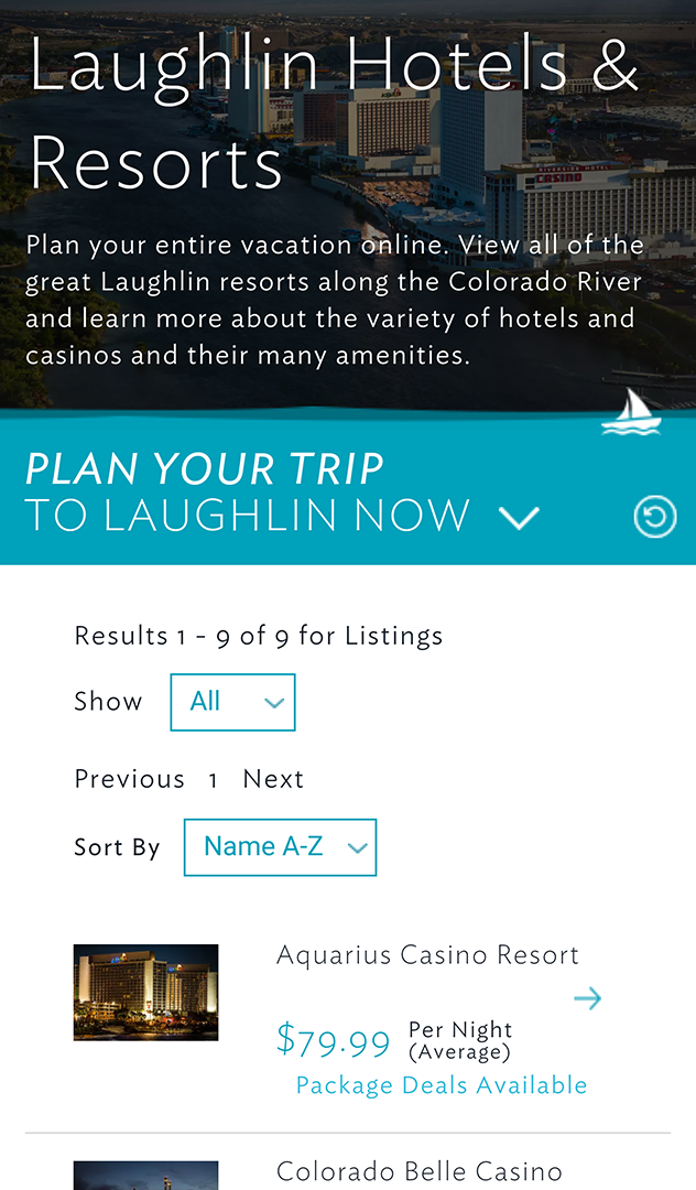
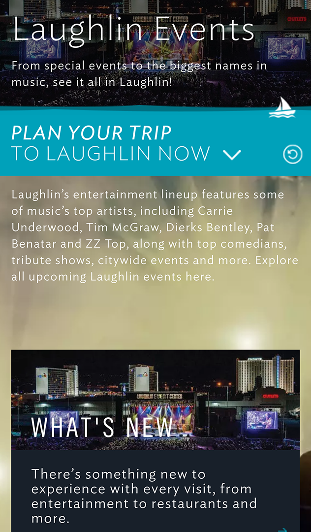
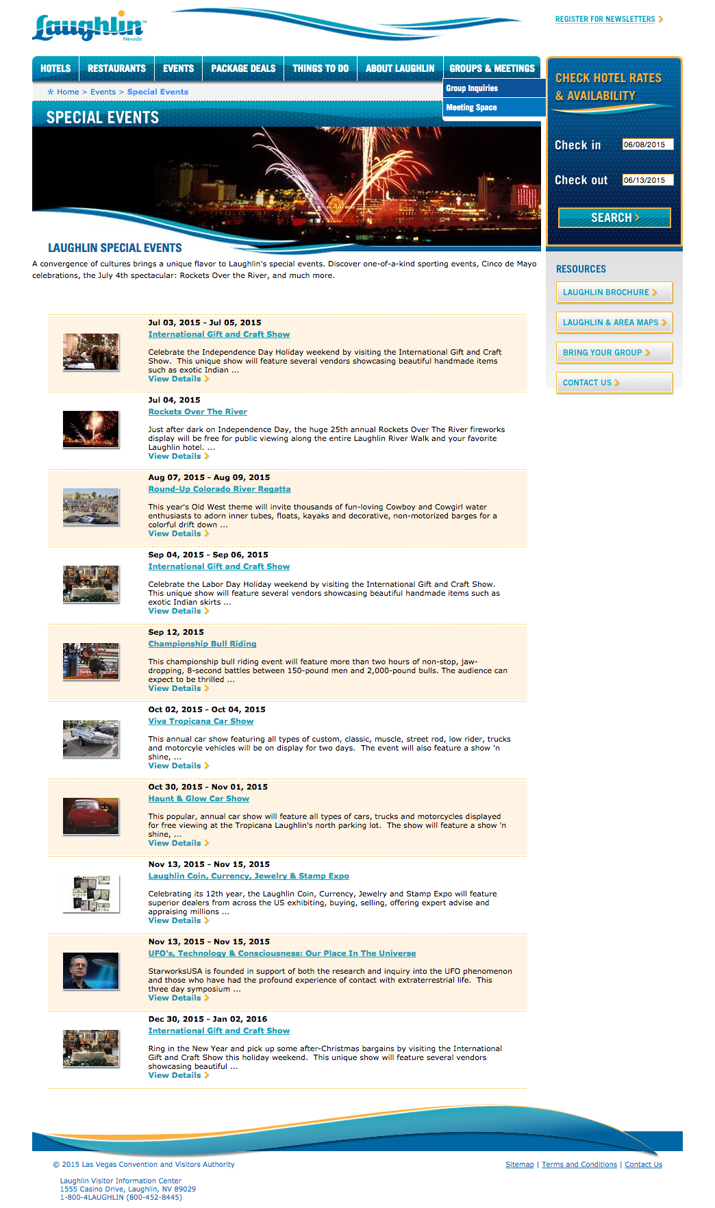
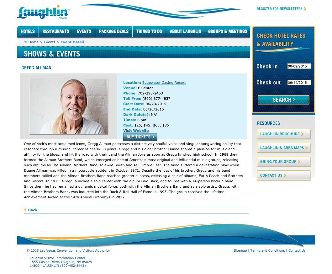
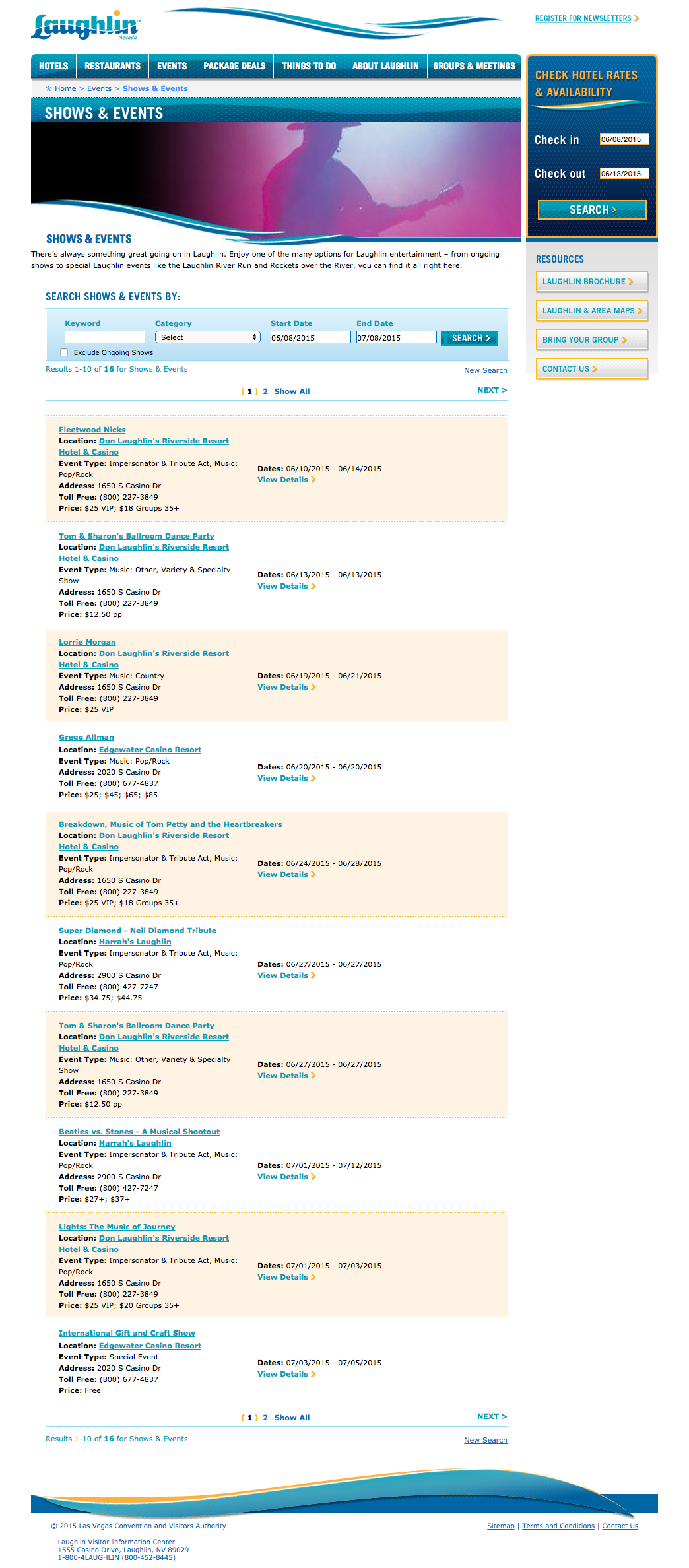
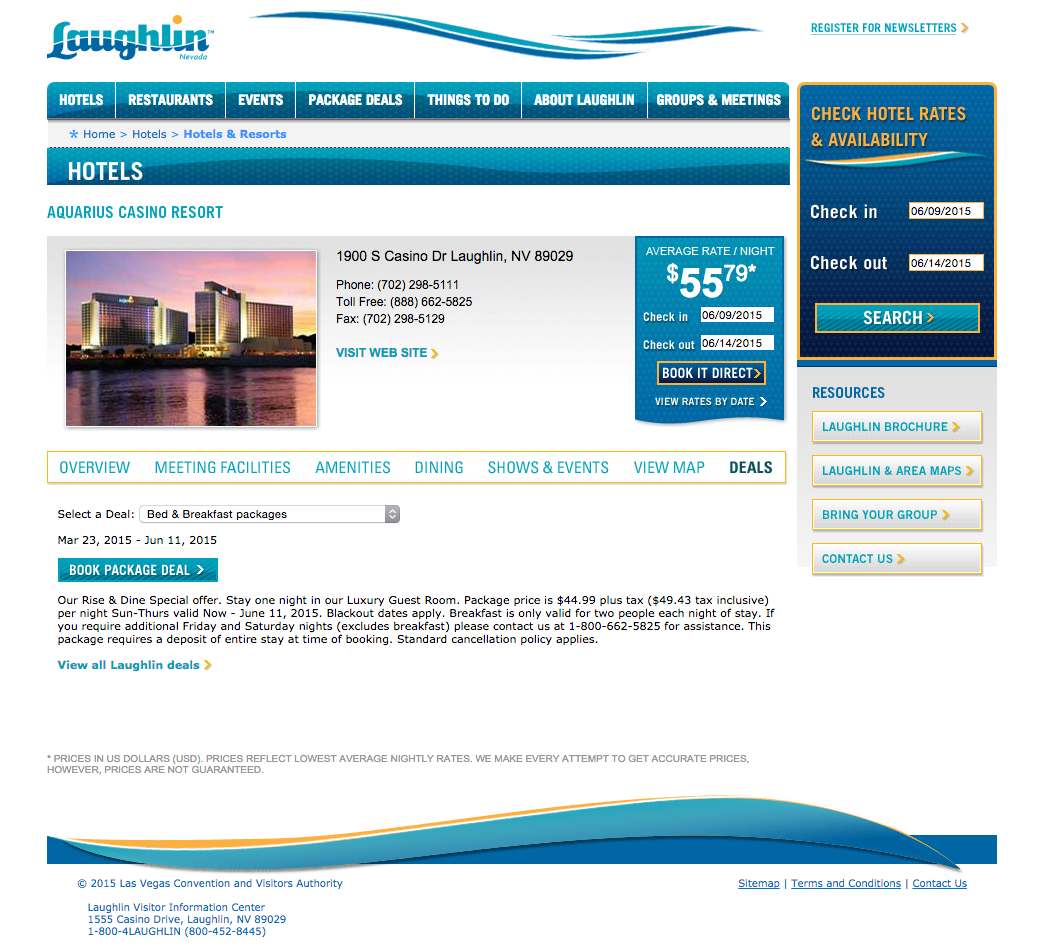
The mobile gallery for this project shows the responsive system across five distinct page types: special events, hotel details, hotels listing, show details, and events. Each reflects the same audience-first hierarchy: the most actionable content surfaces first, booking CTAs have visual dominance, and the layout adapts without losing fidelity to the desktop experience’s content structure.
The hotel detail page on mobile is a useful illustration of the responsive approach in practice. On desktop it can carry a fuller content layout with supporting imagery and sidebar context. On mobile it leads with the property name, key details, and a primary booking CTA, with secondary content accessible by scrolling rather than competing for attention above the fold. The decision about what earns that above-the-fold position was made based on what a Laughlin visitor on a mobile device is most likely there to do: confirm availability and book, not browse.
Outcome
The redesign improved both engagement and conversion for the destination. Specific metric tracking for this project wasn’t available at time of writing, but the directional results were positive across the KPIs the LVCVA used to evaluate the site.
The more durable outcome was a site that finally matched the destination it represented: clear, approachable, and built around the way Laughlin’s visitors actually use it rather than scaled down from a larger template. The responsive system ensured that match held across every device a visitor might use to reach the site, whether planning from home on a desktop or looking up show times on a phone at the casino.
I was the sole designer end-to-end, covering IA, interaction design, and UI for both desktop and mobile within a fully responsive system. The most interesting challenge was calibrating how much to adapt versus how much to preserve from the established LasVegas.com system: a judgment call that required understanding the audience difference clearly enough to defend every place where the Laughlin design diverged from the Las Vegas one. That same judgment extended to the responsive breakpoint decisions, where the Laughlin visitor profile justified a more aggressive simplification at mobile sizes than the Las Vegas site required.