Overview
When we asked visitors to Las Vegas what kind of app they’d actually want, the most common answer was some version of the same thing: tell me what’s happening right now so I know where to go. That answer became the product.
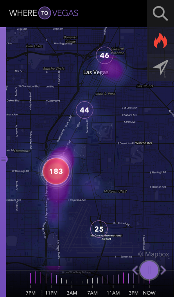
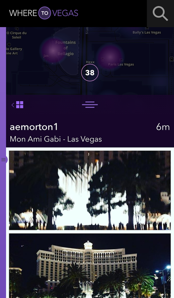
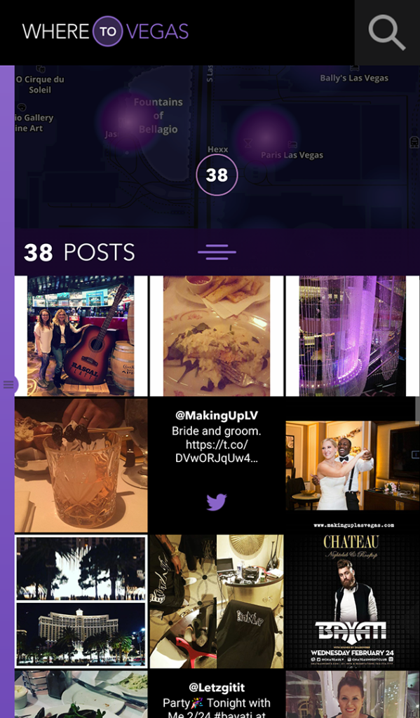
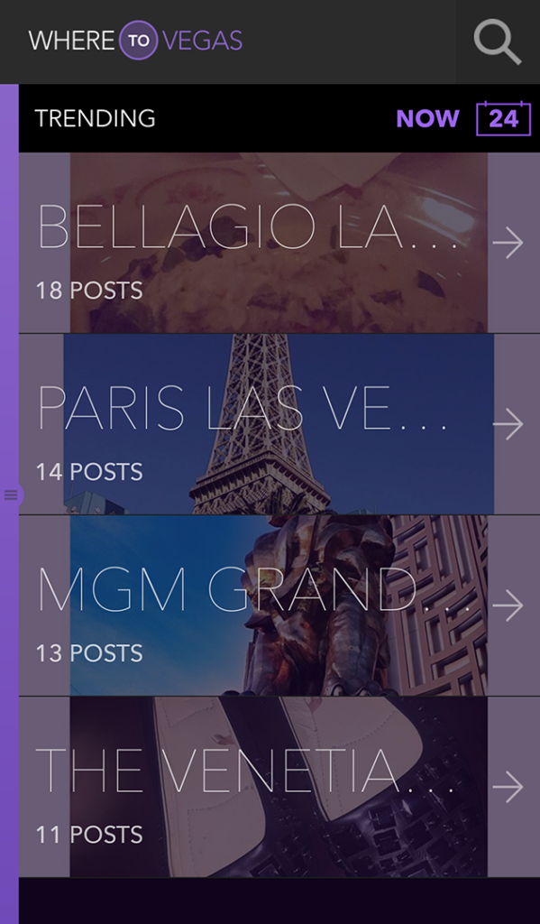
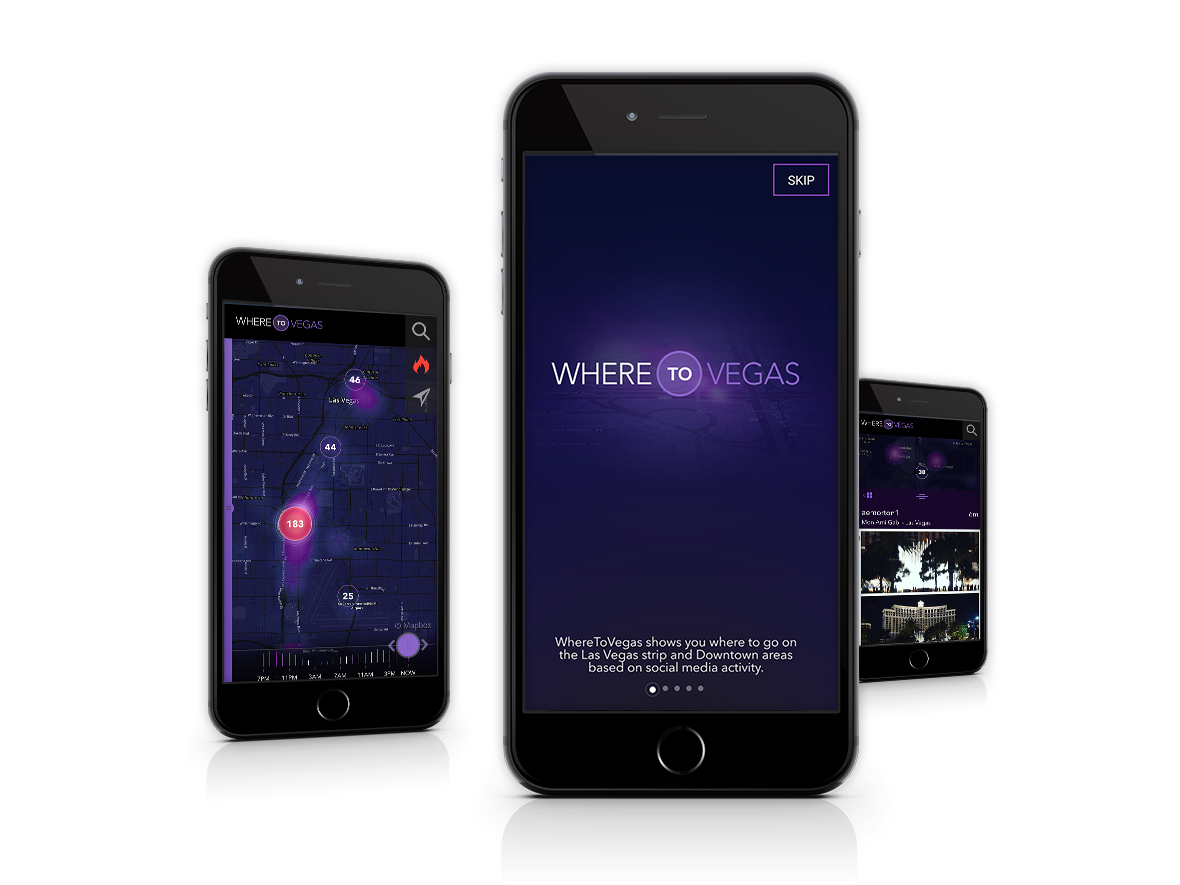
WhereToVegas was a mobile app that mapped real-time social activity across the Strip and Downtown Las Vegas, pulling from Twitter and Instagram to show visitors what was actually happening at any given moment and where the energy was concentrated. Users could browse posts by location on a live map, track trending hashtags, and see what had been popular over the past week. It was a discovery tool built around the way people actually decide where to spend their time.
The app launched publicly, built a returning user base, and averaged over four minutes per session. Those numbers, for a utility app in a crowded tourism market, reflected a product that was genuinely solving the problem it set out to solve.
Note: the app is no longer available. The reasons for that are worth understanding, and they’re addressed below.
The Design Problem
Las Vegas is an overwhelming environment for first-time and returning visitors alike. The options are endless, the marketing noise is constant, and traditional travel apps surface the same curated recommendations regardless of what’s actually happening at any given moment. The gap we were designing for was real-time social signal, not editorial opinion.
The core UX challenge was making that signal legible without making it feel like a firehose. Raw social data is chaotic. The design had to impose enough structure to make it useful (clear geographic context, trending patterns over time, readable post detail) while preserving the live, unfiltered quality that made the concept valuable in the first place.
Research and Exploration
We started with visitor research to understand how people actually made in-trip decisions in Las Vegas: what information they sought out, where they looked for it, and what consistently let them down. The insight that drove the product was how often visitors described feeling like they were missing something happening nearby, without any reliable way to find out what it was.
Multiple concept directions were explored before settling on the map-centric approach. The core question was how to present social activity spatially in a way that communicated density and momentum without requiring users to read through hundreds of individual posts. The trending view emerged as a complement to the map, giving users a time-based lens on the same data for when they wanted context rather than location.
What Happened to It
The app stopped being maintained when platform API changes broke core functionality, and it was eventually pulled rather than updated.
The honest reason is that the client and the agency never fully came to terms with what owning an app requires. Building it was understood. Maintaining it was not. Social platform APIs change, break, and evolve on their own schedules, and an app whose core value proposition depends on live social data needs ongoing engineering attention to stay functional. When that support wasn’t budgeted or prioritized, the inevitable API changes had nowhere to go.
It’s a common failure mode for apps commissioned by organizations that think of software as a deliverable rather than a product. The design and the concept weren’t the problem.
The Idea Still Holds Up
When we originally pitched WhereToVegas, part of the conversation was about scalability. The underlying model, mapping real-time social activity to help visitors navigate a high-density entertainment environment, wasn’t specific to Las Vegas. It was a template. Chicago, Nashville, New Orleans, New York: any city with a concentrated nightlife or tourism footprint has the same visitor problem and the same data available to solve it.
That pitch was ahead of the technical and organizational readiness of the client at the time. But the core idea remains sound. Real-time social signal as a navigation layer for urban entertainment environments is still an underserved space, and the problems we designed around haven’t gone away.
Created at R&R Partners for LVCVA
I led UX on the project from research through shipped product, covering user flows, interaction design, and user testing. The most interesting design work was in the map interaction and the trending logic: figuring out how to present live, unstructured social data in a way that felt immediately useful rather than overwhelming.