
Overview
The product support pages are the most visited pages on Dell’s support site. Every Dell owner, from a consumer troubleshooting a laptop to an enterprise IT admin managing a fleet of servers, passes through here. The original ask was narrow: redesign the Overview tab to prevent instances of empty content and increase engagement with what was already there.
That scope didn’t survive contact with the actual problem.
I was Lead Product Designer on the project, partnered with one other designer and a large extended team of content and product owners spanning every tab on the support page. The redesign was built responsively, with the design system accommodating desktop, tablet, and mobile breakpoints from a unified codebase.
Dell Product Pages
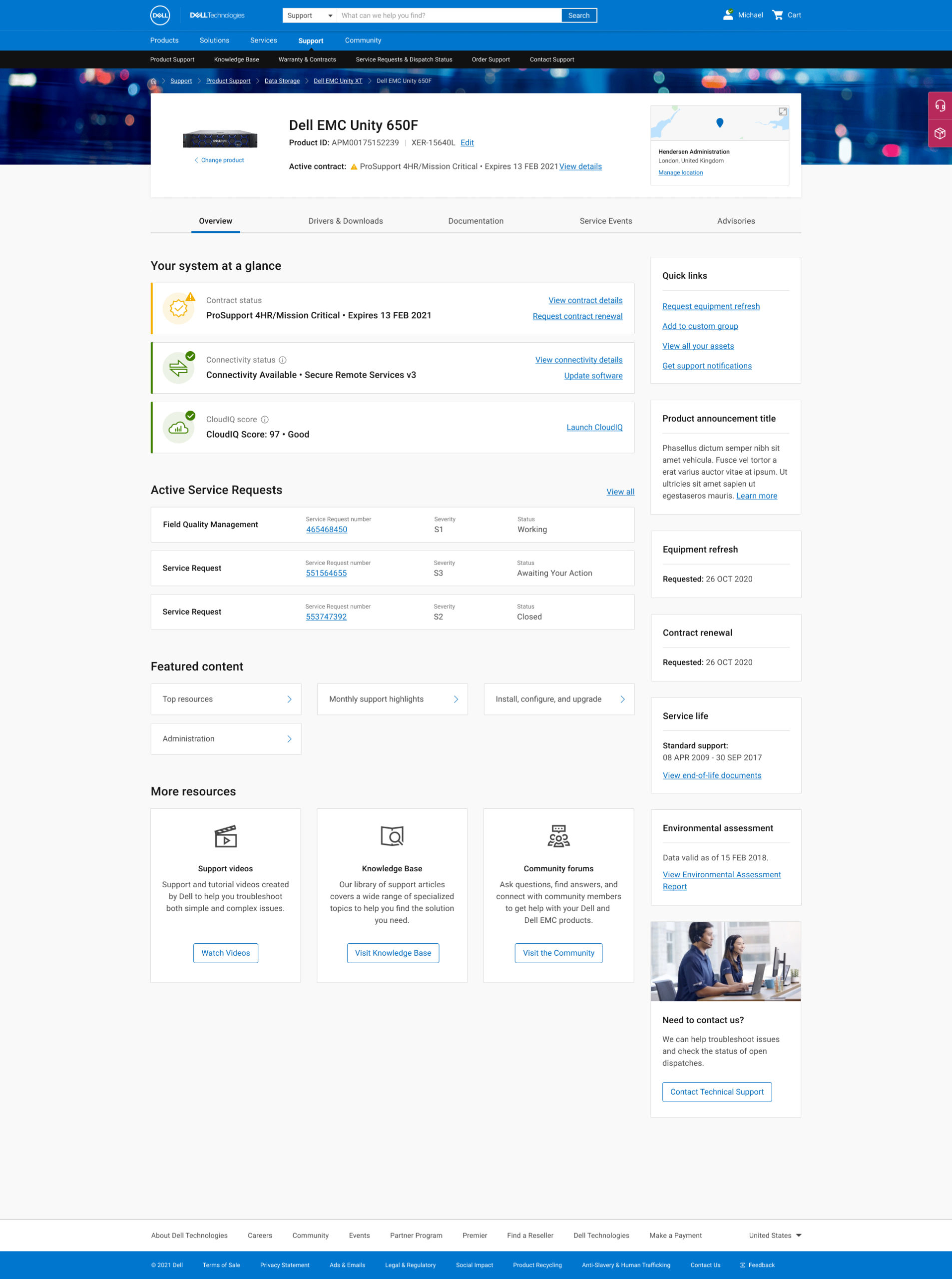
The UX Process
Defining the Problem
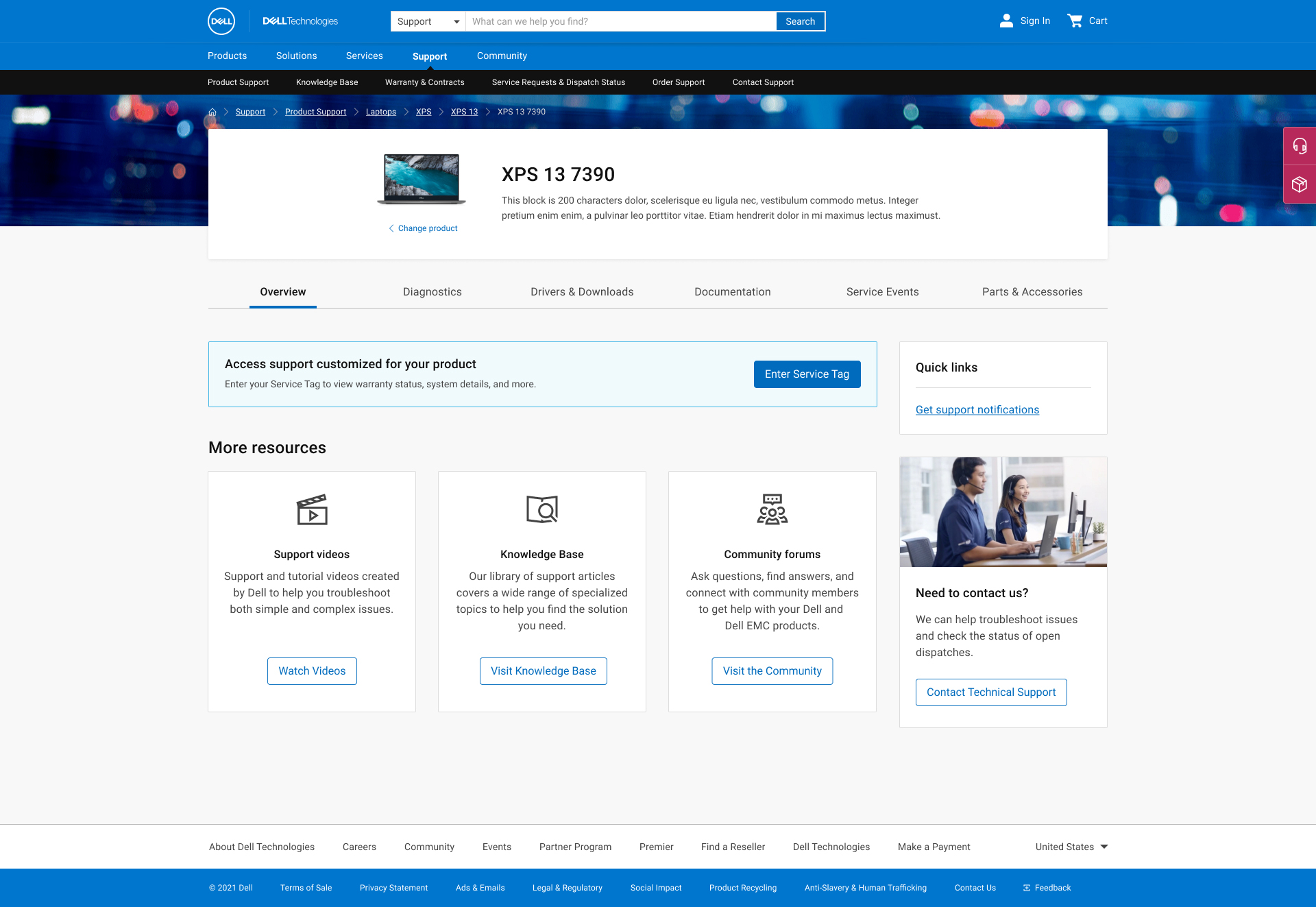
We were asked to redesign the Overview tab so that there would be no instances of little or no content. Success would be measured by increased usage of the content within the tab. However, once we started unpacking the cause of little or no content appearing, we discovered a lot of variables controlling what content might appear and a wealth of opportunity to elevate important content from within the other tabs of the product page. The problem was not that there was no content to show, but what to choose to show when, depending on the variables driving the page content.
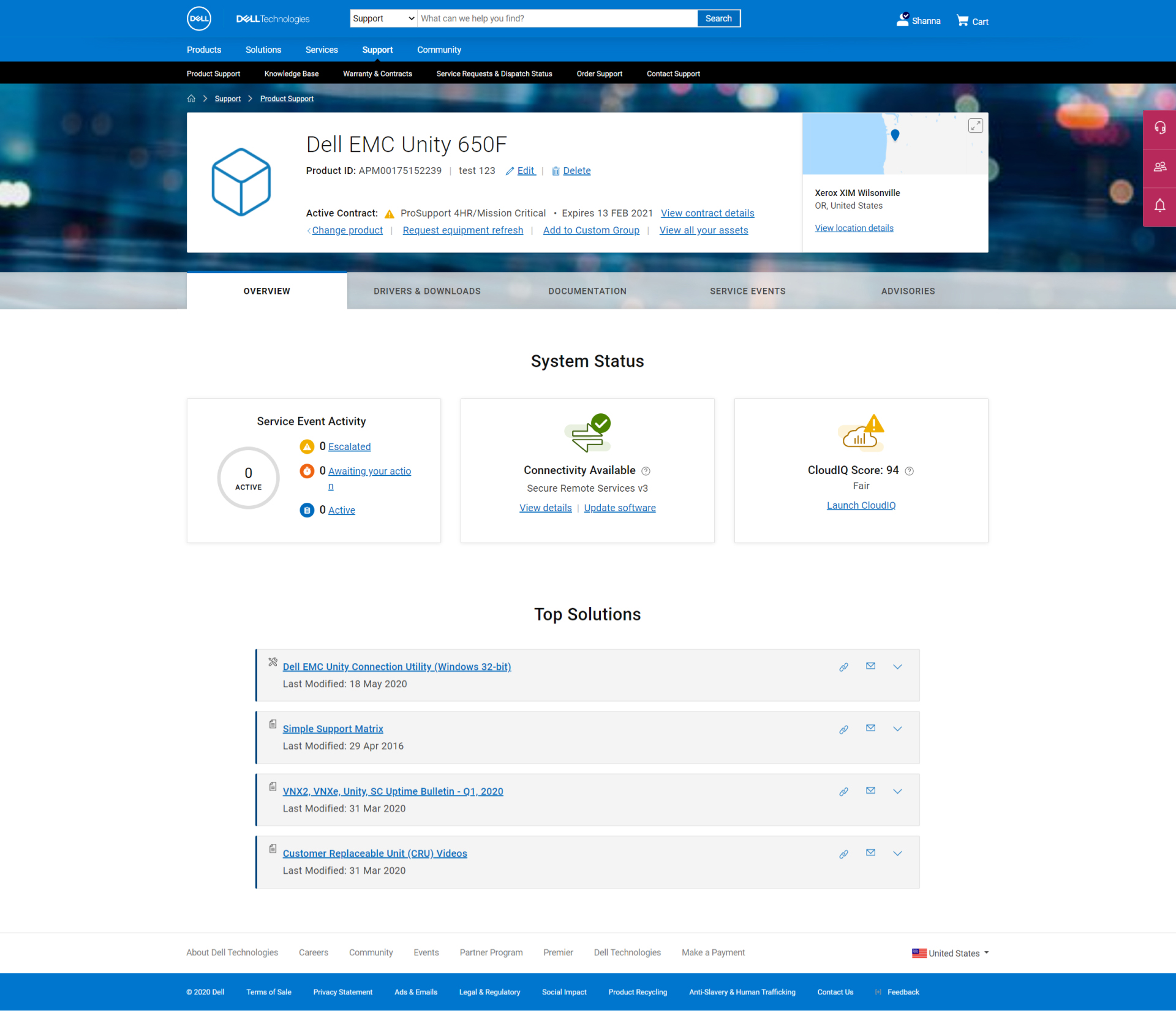
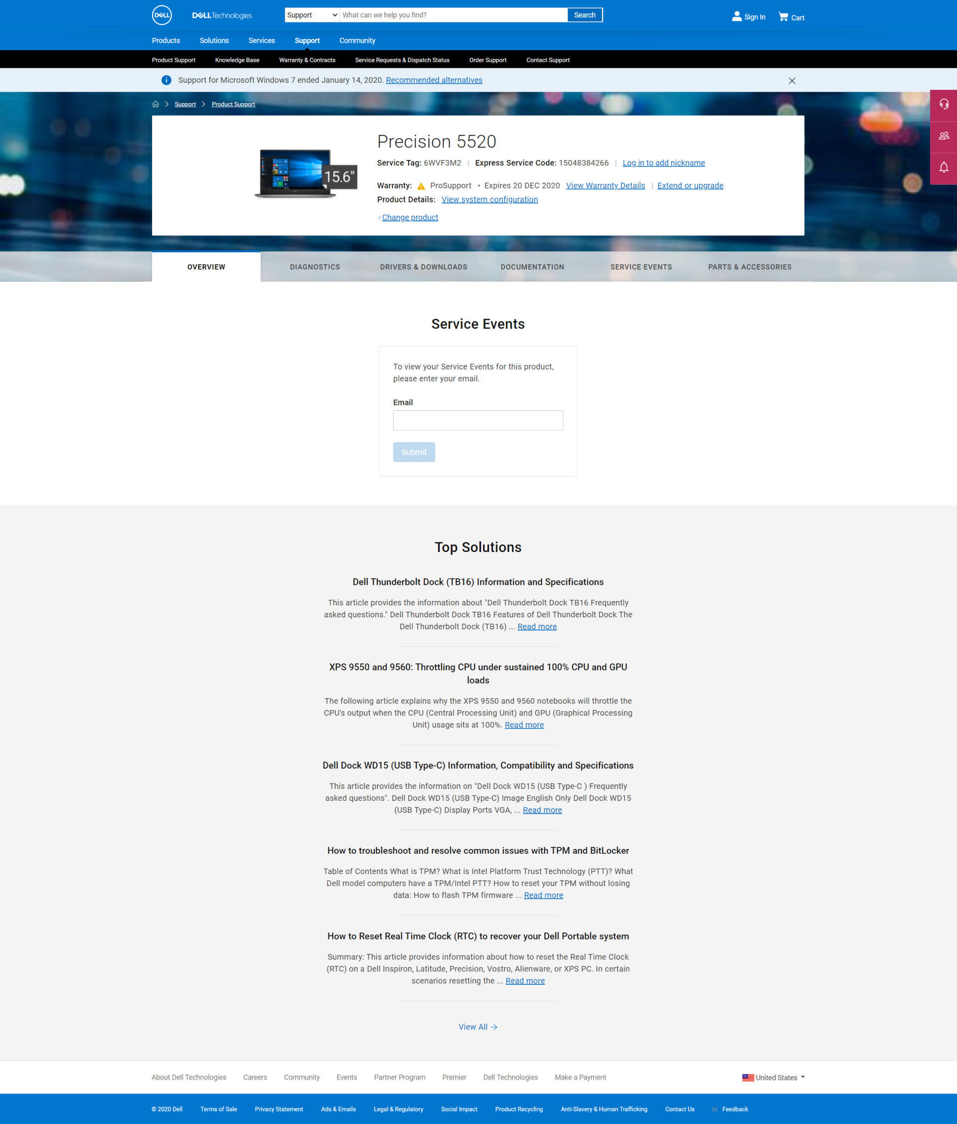
Reframing the Problem
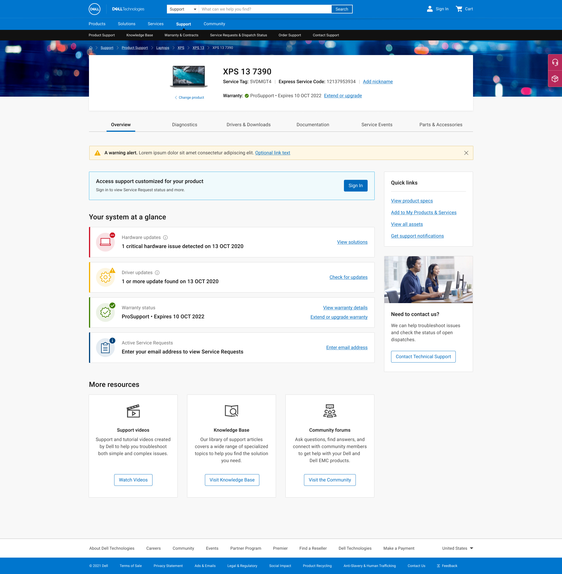
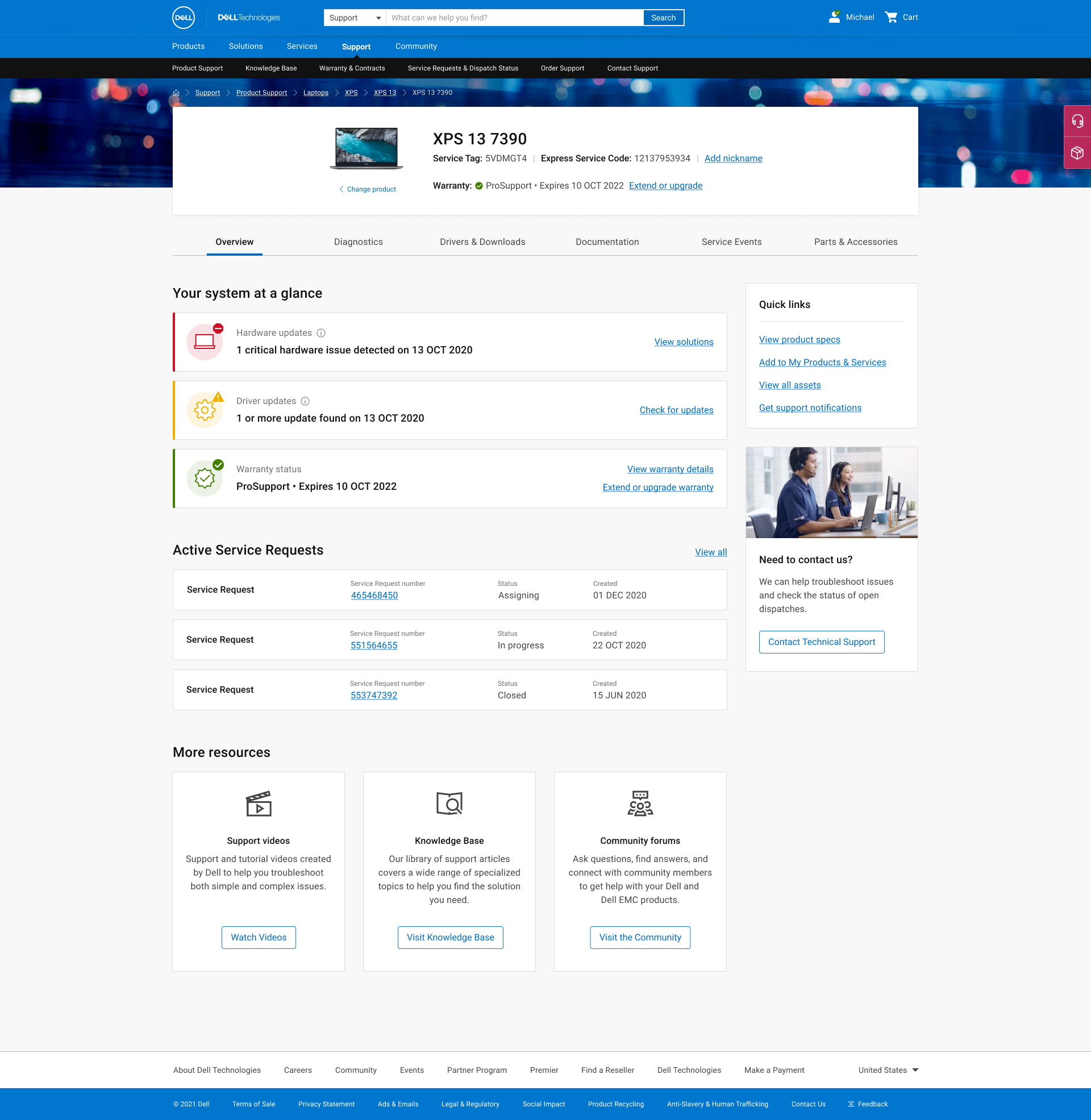
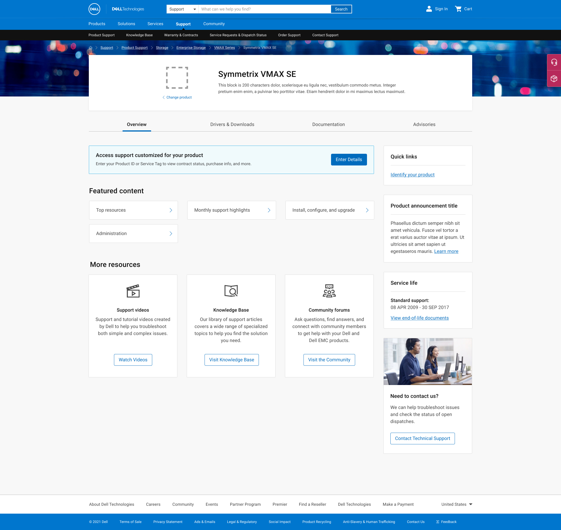
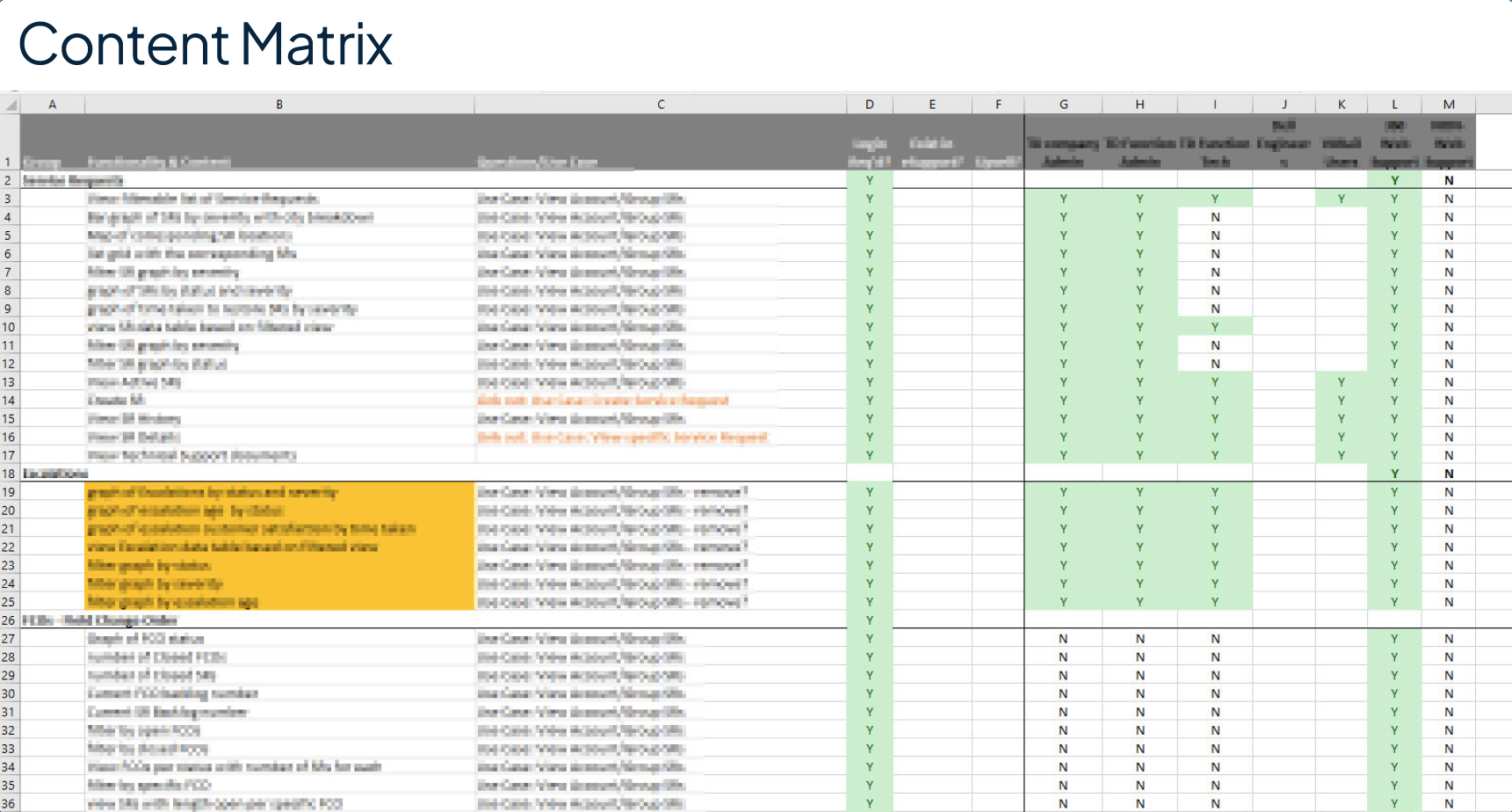
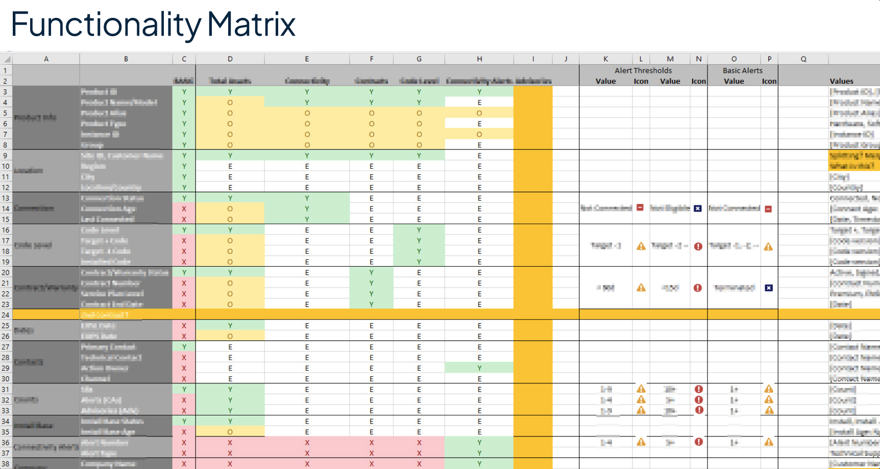
The empty tab issue turned out to be a symptom, not the problem. When we started unpacking why content was missing, we found a complex matrix of variables controlling what any given user could see: five levels of user permissions, four distinct product types, and content that varied depending on whether we were showing an individual product model, a series, or a product family. The most valuable content of all, personalized diagnostics and service information, was only available when we had a specific serial number.
The real design challenge wasn’t “what do we put in the Overview tab.” It was: given all these variables, what is the right content to show to which user, in which state, and in what order of priority?
That question had to be answered before any page architecture or visual design could begin. Leading the product team and stakeholders through that content decision-making process became the central work of the project.
Mobile as a Critical Support Channel
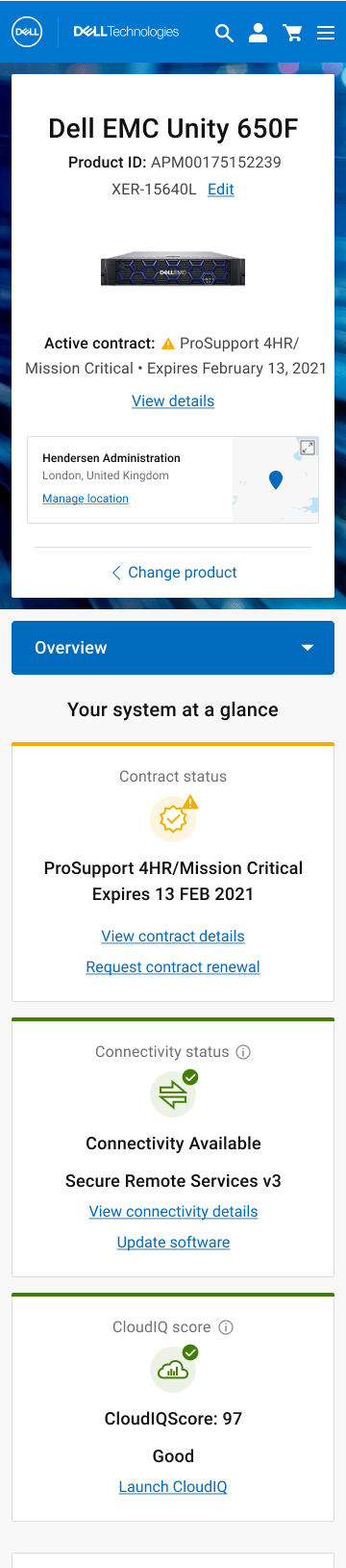
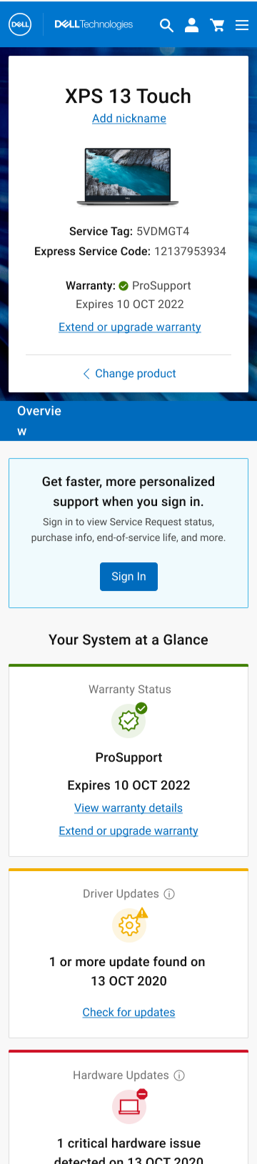
Mobile was in scope from the start as a responsive surface, and for a reason that shaped every decision we made for that breakpoint: if your laptop is offline or won’t boot, your phone is your only path to get help. Because the site was built responsively rather than as a separate mobile build, the design decisions made for mobile had direct implications for the full system. That use case, a user in a support emergency with no desktop access, gave mobile a different character than any other context on the site. These users have high urgency, low patience, and no tolerance for an experience that promises something it can’t deliver.
It also introduced a specific technical constraint. The automated service tag detection that powered the personalized desktop experience relied on browser-level capabilities unavailable on mobile. Rather than surface a detection CTA that couldn’t function, we removed it entirely from the mobile experience. Manual tag entry remained, as it had always been user-initiated on desktop as well. The decision to remove the shortcut rather than leave a broken promise in the UI was one of the clearest calls on the project: a user troubleshooting a bricked laptop on their phone is exactly the wrong person to show a feature that fails them.
The content hierarchy on mobile was also shaped by the state matrix. Unauthenticated mobile users, which was the majority, landed in a state where the design had to do real work with limited information. The approach was to surface whatever was knowable without authentication first: warranty status, driver updates, hardware alerts, service tag confirmation. Sign-in was positioned as an upgrade to a richer experience, not a gate blocking a basic one. A user who couldn’t or wouldn’t sign in still left with something actionable.
content Strategy
We started with an audit. At the outset there were three categories of content in play: what was already on the pages, what stakeholders wanted to add, and what we believed users would actually find valuable. Before designing anything, we needed to know which of those overlapped and which didn’t.
User input shaped the priority model. We brought in both consumer and enterprise users early to understand what they were looking for when they landed on these pages, and used that to build a content hierarchy that reflected actual need rather than internal assumptions about what mattered.
With priorities established, we mapped content availability against the full permission and product-type matrix. This produced a clear framework for what to surface, when, and for whom, and gave us the foundation to design page states that never felt empty, because every state was intentional.
Validation and Iteration
Testing ran across all four primary user states and both audience types. We validated findability of critical information, usability of key interactions, and comprehension of iconography and color usage. The process ran four rounds of iteration before we reached a result we were confident in.
Four rounds sounds like a lot. In this case it reflected the complexity of the problem space honestly. Each round was resolving a specific layer of the experience, and each one produced a measurably better result.
impact
%
CSAT up 28% three months
after launch
%
Self-Support Failure Rate down 37%, reducing inbound call volume to Dell support agents
%
“Service Tag Not Recognized” errors down 84%, getting users to their personalized support
page faster
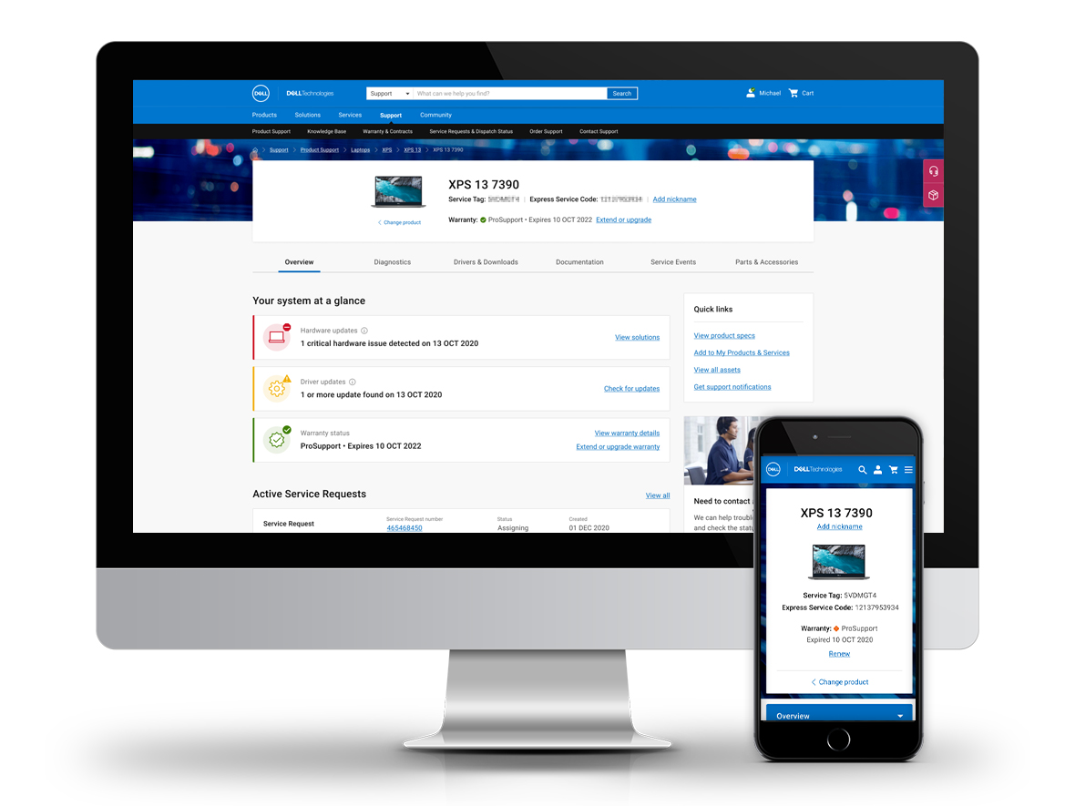
I led design across the full project lifecycle, from problem definition and content strategy through IA, interaction design, and final UI. My most significant contribution wasn’t the visual work: it was leading the product team through the content logic decisions that made the design possible in the first place.
That same framework extended to mobile, where the responsive implementation meant mobile wasn’t a separate handoff but an integrated part of every design decision. The constraints were different at smaller breakpoints, but the underlying logic was the same: know your user’s context, know what you can reliably deliver, and make every state feel intentional rather than incomplete.